
Brand Strategy, Design & Marketing Insights
Find your industry:
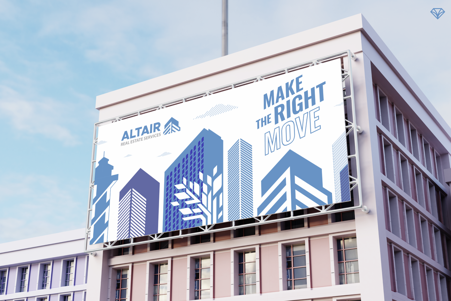
How Strategic Branding Helped Altair Real Estate Stand Out in a Competitive Market
Altair Real Estate Services partnered with Gem City Creative to modernize its brand identity and stand out in a crowded real estate market. The project included a redesigned logo, a versatile icon representing both residential and commercial buildings, and a cohesive visual system that extended across signage, collateral, and marketing materials. To strengthen Altair’s local connection, the brand also incorporated an illustrated Erie cityscape tied to the company’s identity. The result was a recognizable, adaptable, and community-focused brand designed to build trust, improve visibility, and support long-term growth across Pennsylvania and New York markets.

How Project Curb Appeal Built an HGTV-Inspired Brand That Still Felt Local
Project Curb Appeal is a community-driven home renovation initiative founded by Megan Demarco and Stacy Santos of ReMax Real Estate. Inspired by HGTV makeover shows, the project renovates home exteriors for families in Erie who need support but cannot afford repairs themselves. Gem City Creative helped develop a brand identity that balanced polished television-style excitement with authentic local appeal. Through strategic logo design, typography, color selection, and promotional graphics, the branding helped create energy around the initiative while staying grounded in the community it serves. The result is a recognizable, uplifting identity that supports awareness, volunteer engagement, and long-term growth.
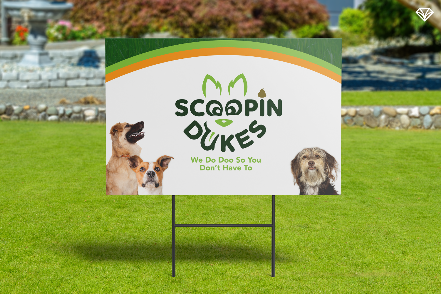
How to Build a Pet Service Brand People Actually Trust (Even When It’s About Poop)
Scoopin’ Dukes is a subscription-based pet waste removal service built for busy pet owners. The challenge was creating a brand that felt both professional and approachable in an industry that often leans too far in one direction. By embracing the nature of the service instead of avoiding it, we developed a clean, modern identity with a friendly tone. A meaningful mascot, intentional color palette, and clear website structure helped build trust and drive conversions. The result is a brand that feels human, clear, and easy to engage with. This project highlights how strong branding can elevate even the most unexpected services.
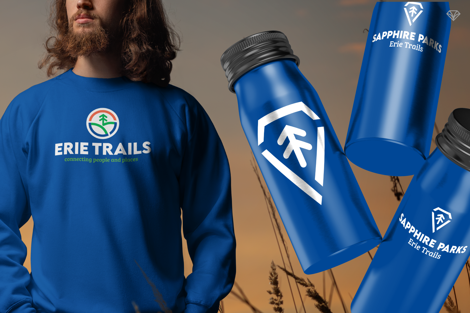
Erie Trails Brand Refresh: Turning a Regional Parks System into an Everyday Adventure
Erie Trails transformed its outdated identity into a bold, flexible brand designed to inspire community engagement and outdoor exploration. Despite having incredible parks and trails, the organization struggled with awareness and recognition. By creating a scalable logo, functional color system, custom icons, and adaptable templates, the new brand works across signage, marketing, and outreach. Sub-brands like Sapphire Trails and kid-focused experiences add depth and accessibility. The result is a cohesive system that makes Erie’s natural assets more visible and inviting. This rebrand helps shift perception, turning local parks into exciting destinations for residents and families year-round.
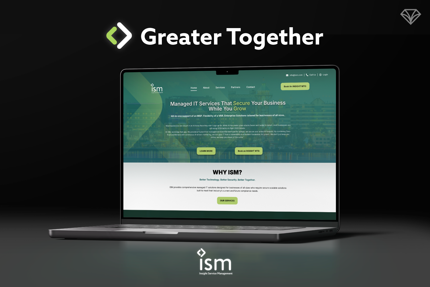
How We Delivered Our Most Ambitious Brand System in the Shortest Month of the Year
In the shortest month of the year, we delivered our most ambitious branding project yet. ISM, a rapidly growing cybersecurity company, had outgrown its regional identity and needed a brand that matched its national reach and premium services. We responded by building a sleek, modern brand system designed for scalability. Through design systems, templates, and a full suite of marketing assets, we equipped their team to move faster without sacrificing consistency. The result was more than a rebrand. It was a strategic foundation for growth, helping ISM position itself as a trusted cybersecurity partner for businesses of all sizes.
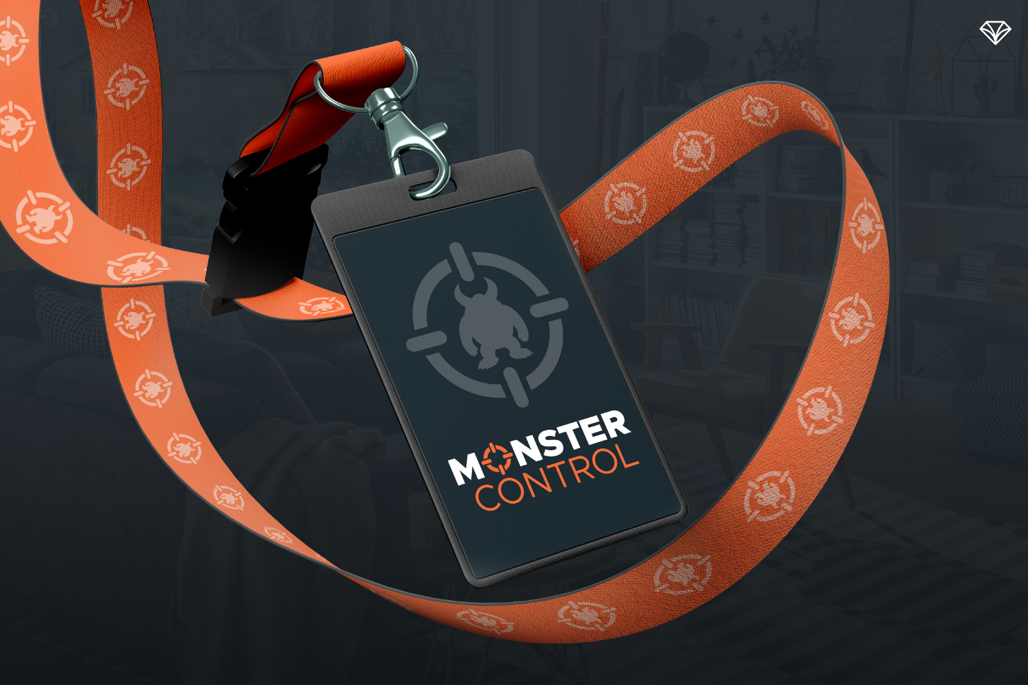
From Fear to Confidence: How Strategic Branding Helped Monster Control Turn Childhood Fears into a Trusted Experience
Monster Control is a unique service designed to help children face their fears of monsters through imagination, empowerment, and hands-on experiences. However, the company needed a brand identity that balanced playful storytelling with the credibility parents expect from a professional service. Gem City Creative developed a bold yet child-friendly visual identity inspired by real pest control branding. Through a sleek logo, versatile design system, strategic color palette, and a clear long-scroll website, the new brand communicates strength, safety, and imagination. The result is a brand that builds trust with parents while helping children feel confident and brave in their own homes.
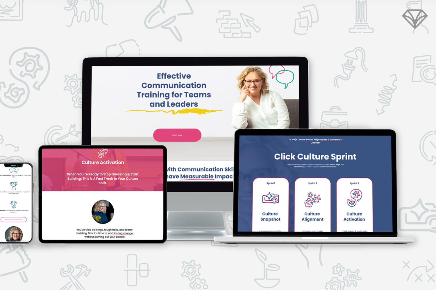
Building Communication Systems That Scale With Growth
Click Pragmatics, founded by workplace communication specialist Casie Lucas-Szumigala, helps companies repair leadership disconnect and strengthen workplace culture. As her business entered a major growth stage, her branding no longer reflected her expertise or direction. Gem City Creative developed a strategic design system built around audience funnels, conversion clarity, and scalable content creation. The refreshed brand preserved her bold, colorful personality while introducing structure, custom icons, streamlined templates, and a funnel-driven website. The result is a sustainable, modern brand foundation that supports workshops, courses, consulting, and podcast growth while modeling the clarity and balance she brings to workplace communication.
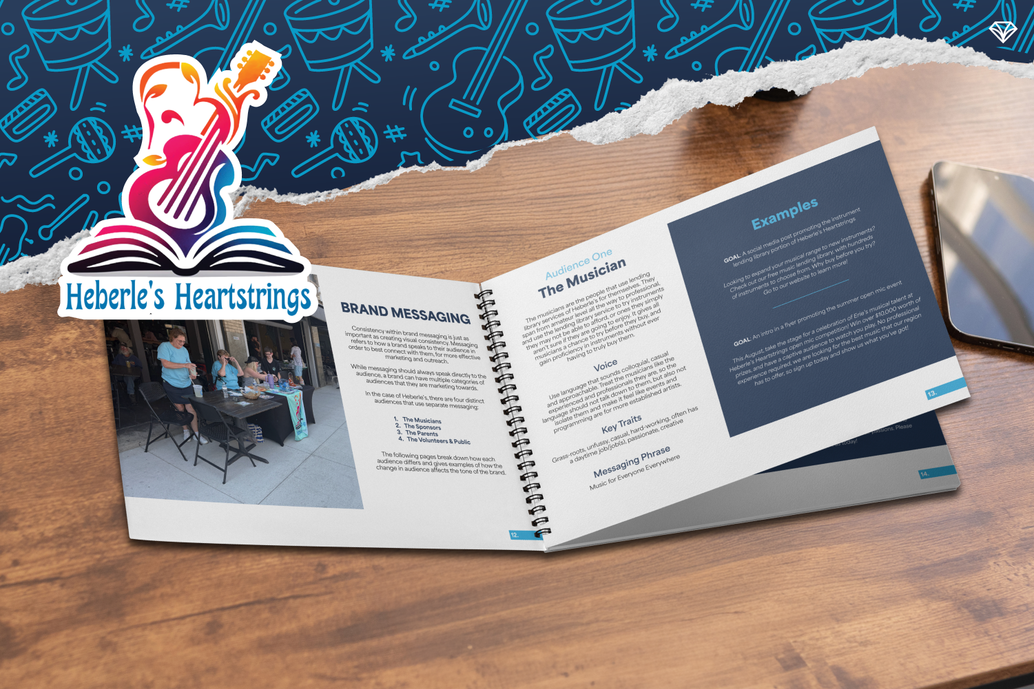
How Strategic Brand Messaging Helped Heberle’s Heartstrings Amplify Music Access in Erie and Beyond
Heberle’s Heartstrings, a nonprofit in Erie, provides inclusive access to musical instruments and performance opportunities for people of all backgrounds. As the organization expanded, inconsistent messaging and visuals limited their impact. Through a comprehensive brand audit, refined audience personas, strategic messaging, and a cohesive visual identity, we helped create a scalable brand foundation. The result is a clear, consistent, and joyful brand guide that supports growth, community engagement, and future expansion into physical spaces and school programming. Now, Heberle’s brand reflects the strength of its mission and the legacy that inspired it.
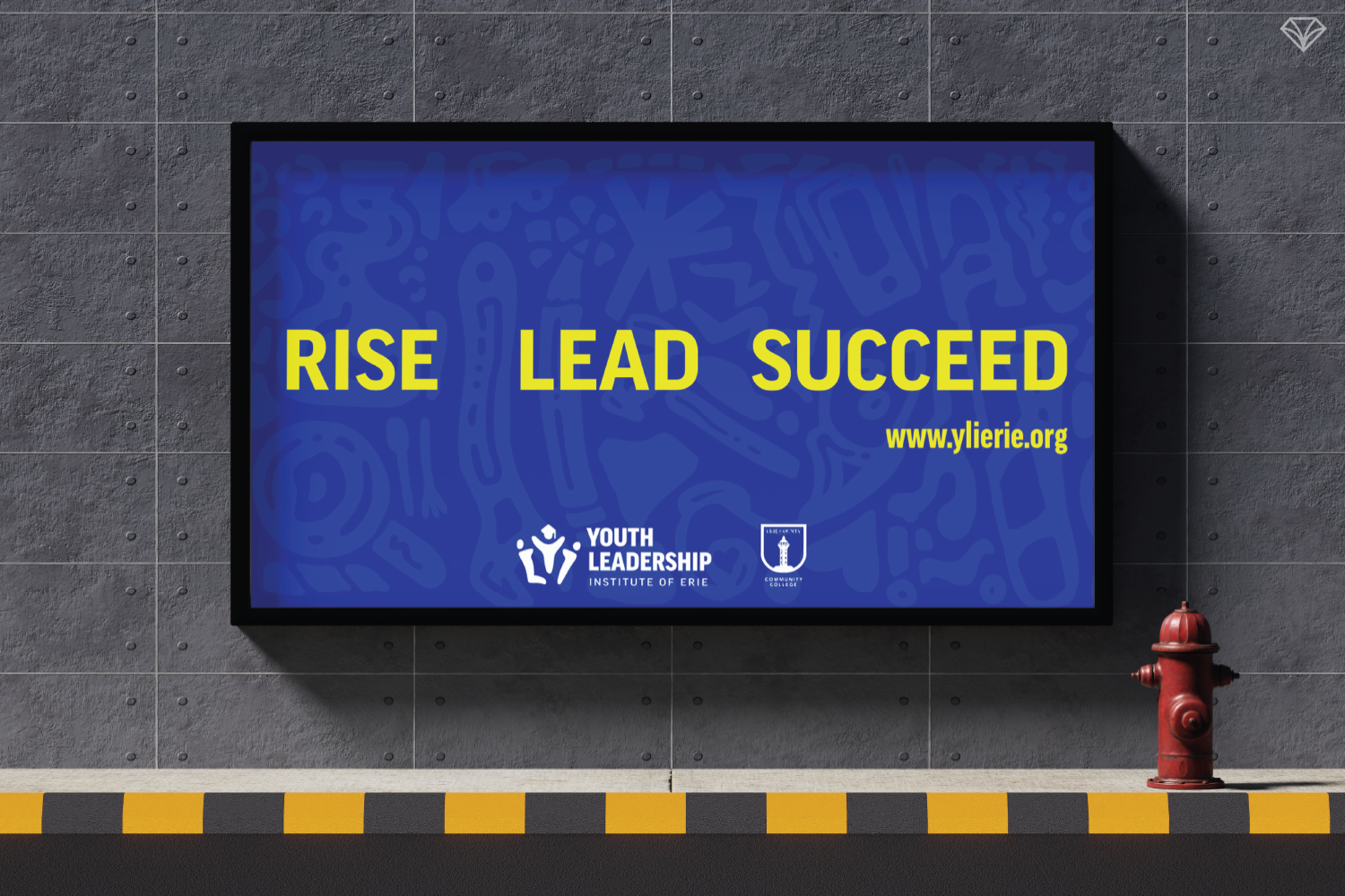
A Brand To Rise, Lead, and Succeed Into The Future: The YLI Story
The Youth Leadership Institute of Erie needed a brand that could connect with both high school students and the sponsors who support them. Gem City Creative partnered with CEO Edison Nicholson to modernize YLI’s identity, creating a flexible brand system rooted in youth culture while remaining professional and sponsor-ready. Through mood boards, message distillation, and a full visual overhaul, GCC helped define the rallying message Rise. Lead. Succeed. The result is a clear, adaptable brand that reflects YLI’s mission, strengthens community trust, and supports long-term impact across Erie County.
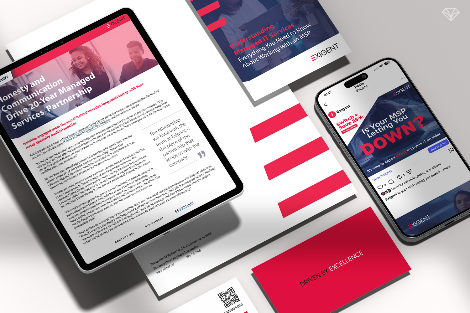
How a Long-Term Design Partnership Helps Cybersecurity Brands Stay Ahead of Threats and the Market
Exigent Technologies is a cybersecurity and managed IT provider built on long-term partnerships, proactive strategy, and people-first service. In a fast-moving industry, they needed a design partner who could keep pace with constant updates while maintaining brand consistency across campaigns, platforms, and years. Gem City Creative serves as that long-term partner—providing fast turnarounds, strategic guidance, and deep brand knowledge. Through a sleek yet approachable visual identity and ongoing collaboration, Exigent’s brand remains modern, trustworthy, and ahead of the competition—helping clients feel confident, secure, and supported.
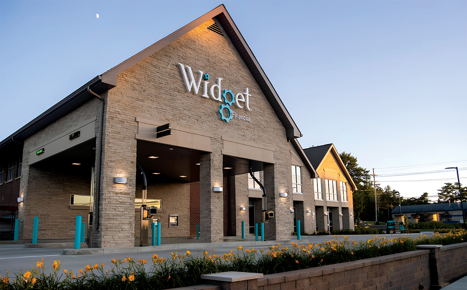
How a Strategic Rebrand Helped Widget Financial Build Trust and Accelerate Growth
Widget Financial’s rebrand marked a turning point—from a locally recognized credit union to a modern, trusted financial institution with nearly $500M in assets and 46,000 members. Gem City Creative partnered with Widget to create a flexible brand system built for speed, consistency, and growth. Through strategic design, distinctive mascots, and a scalable visual language, Widget gained instant recognition and creative freedom—without sacrificing compliance. This long-term partnership allows Widget to evolve confidently while staying focused on what matters most: serving its community and moving the organization forward.
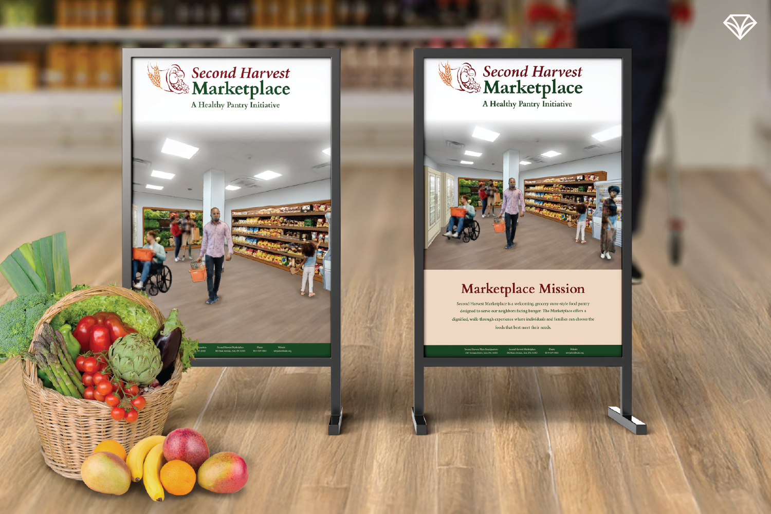
Designing With Dignity: How Second Harvest Food Bank Built a Flexible, People-First Brand System
Second Harvest Food Bank needed a brand system that could grow with its evolving programs while maintaining warmth, dignity, and consistency. As a small nonprofit serving Erie County and surrounding areas, outdated and inflexible materials were costing valuable time and clarity. By creating an adaptable Canva-based design system, SHFB gained the freedom to update materials quickly without sacrificing polish or trust. Rooted in people-first values, harvest-inspired colors, and real community imagery, the refreshed brand supports both outreach and innovation allowing SHFB to focus on what matters most: providing stable, respectful access to food for the community.
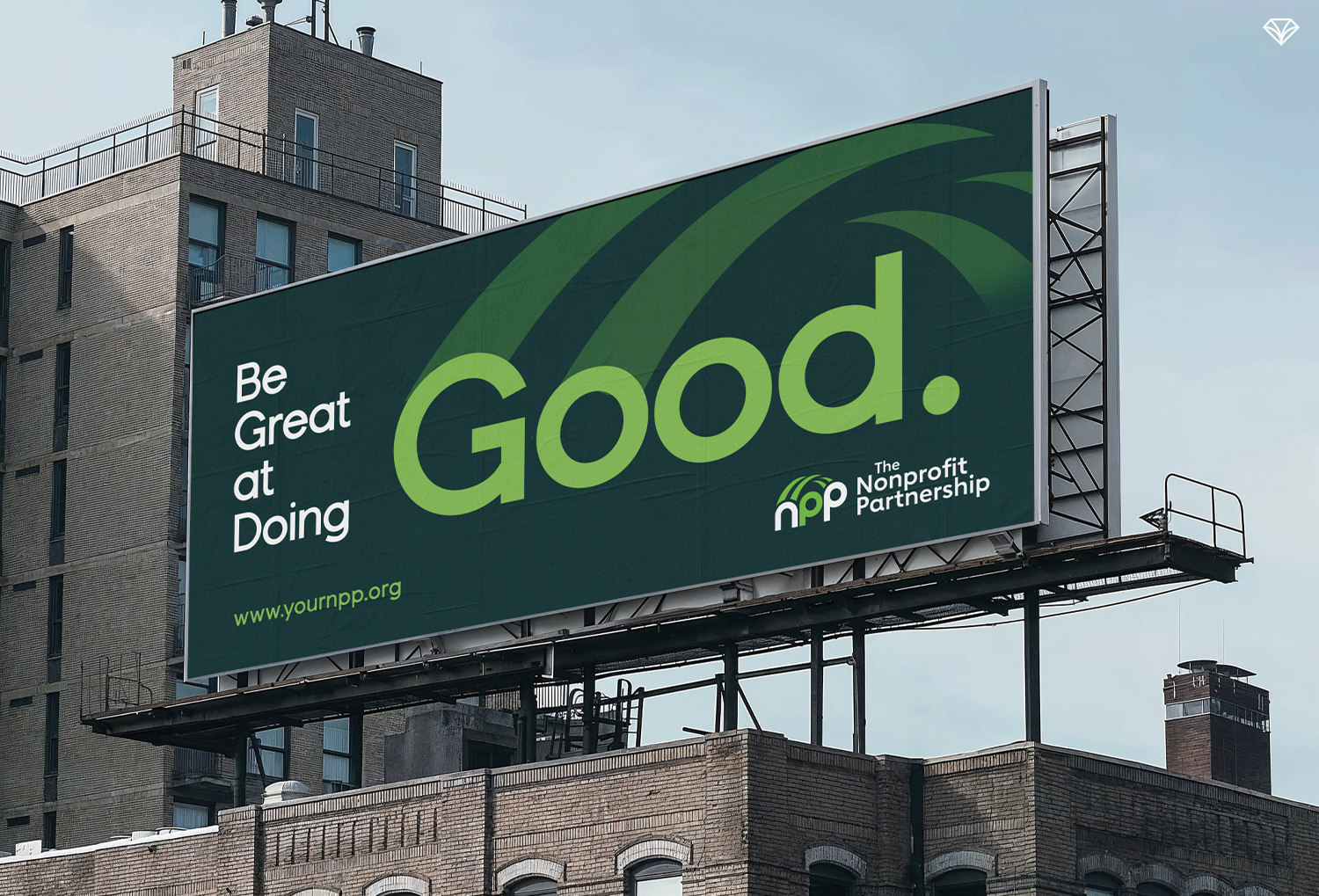
Building Bridges Through Branding: How NPP’s Visual Identity Reflects Its Mission
When a nonprofit partnership approached Gem City Creative, they needed more than a logo refresh—they needed clarity. Their existing identity lacked meaning and caused confusion with another local nonprofit. Through discovery sessions, we uncovered their core role as a connector—advancing best practices, fostering relationships, and strengthening the nonprofit sector. That insight led to a bridge-inspired brand concept rooted in connection and community. By translating strategy into a meaningful visual identity and showing the logo in real-world contexts, the final brand tells their story with confidence. The result is a collaborative, purpose-driven identity built to serve them for years to come.

How the Erie Regional Chamber Modernized Its Brand to Reflect a Stronger, More Unified Future
The Erie Regional Chamber partnered with Gem City Creative to modernize a dated and fragmented brand identity. Through deep brand strategy sessions, we uncovered key attributes—innovation, leadership, and community support—that shaped the redesign. We unified the Chamber’s multiple sectors under a cohesive color-coded system and introduced a new logo featuring forward movement and a subtle nod to Erie’s peninsula. Updated typography, purposeful imagery guidelines, and refined visual standards now communicate clarity and progress. The revitalized identity positions the Chamber as a bold, collaborative leader guiding Erie’s economic transformation.

How Lab Aids’ Fresh New Brand Identity Helps Teachers Bring Learning to Life
their new partnership with Connected Mathematics, they needed a modern brand identity that reflected their expanded offerings without losing their friendly, educator-first personality. We created a color-coded visual system—coral for math, green for science, and blue for corporate—supported by playful gradients and bubble elements. The result is a unified, approachable identity that stands out at tradeshows, communicates clearly across materials, and feels exciting for both teachers and students. This refreshed brand brings clarity, consistency, and energy to every part of the Lab Aids experience.
How a Bold Rebrand Positioned FRC for Its Next Era of Innovation and Growth
FRC, a longstanding leader in cybersecurity and IT solutions, needed a brand identity that reflected the innovation and global momentum happening inside the company. Their previous visuals tied closely to their early roots and no longer communicated the forward movement, ecosystem collaboration, and people-focused mission they embody today. Gem City Creative redesigned FRC’s brand around three core ideas—aggregation, uplift, and innovation—resulting in a modern logo, bold color palette, and simplified name that supports their expanding footprint. The refreshed identity honors their heritage while positioning FRC for its next era of growth, technological advancement, and international impact.

How FERVELL Is Redefining What a Modern CPA Firm Looks Like
FERVELL is a modern CPA firm founded by Kyle and Ryan to elevate how people experience tax advisory. Their mission goes beyond filing taxes—they educate clients so they can gain clarity, confidence, and control over their financial future. With a premium, tiered service model, clients can start with foundational support and work toward proactive tax strategy over time. The brand blends innovation with trust, using mountain-inspired visuals to symbolize vision and growth, paired with sharp, modern design elements to reflect disruption. The result is a premium yet approachable brand that empowers clients to rise to new financial heights.

How Franco’s Rebrand Revived a Local Erie Favorite: A Fresh Take on a Classic Diner
Franco’s, a beloved restaurant in Erie, PA, partnered with Gem City Creative for a brand refresh to modernize their look while staying true to their local roots. With a new location in the works, this was the perfect time to update their visual identity. The redesign includes a bold typographic logo, a playful diner-inspired color palette, and friendly, approachable fonts. Menus and a modern website now reflect the warmth and community-driven experience Franco’s is known for. This strategic restaurant branding positions Franco’s to continue growing within Erie while celebrating their classic, welcoming atmosphere.