How a Strategic Rebrand Helped Widget Financial Build Trust and Accelerate Growth
By standing out with a bold, modern brand, Widget Financial has built recognition, trust, and lasting impact among members.
Client Background: A Credit Union in Transition
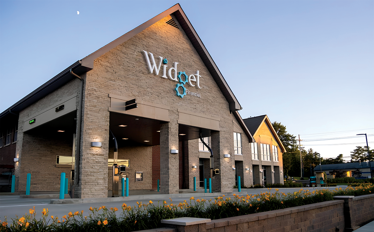
Widget Financial is a not-for-profit credit union based in Erie, Pennsylvania, serving individuals and families throughout the Erie region. When the organization began working with Gem City Creative, it held approximately $250 million in total assets, positioning it as a small to mid-sized credit union on a national scale.
At the time, the credit union operated under the name Erie General Electric Federal Credit Union. As the organization evolved and no longer maintained formal ties to General Electric, leadership recognized the need for a name and identity that better reflected who they were—while still honoring their history. Gem City Creative was engaged to support and augment Widget’s internal marketing team through a strategic name change and rebrand to Widget Financial.
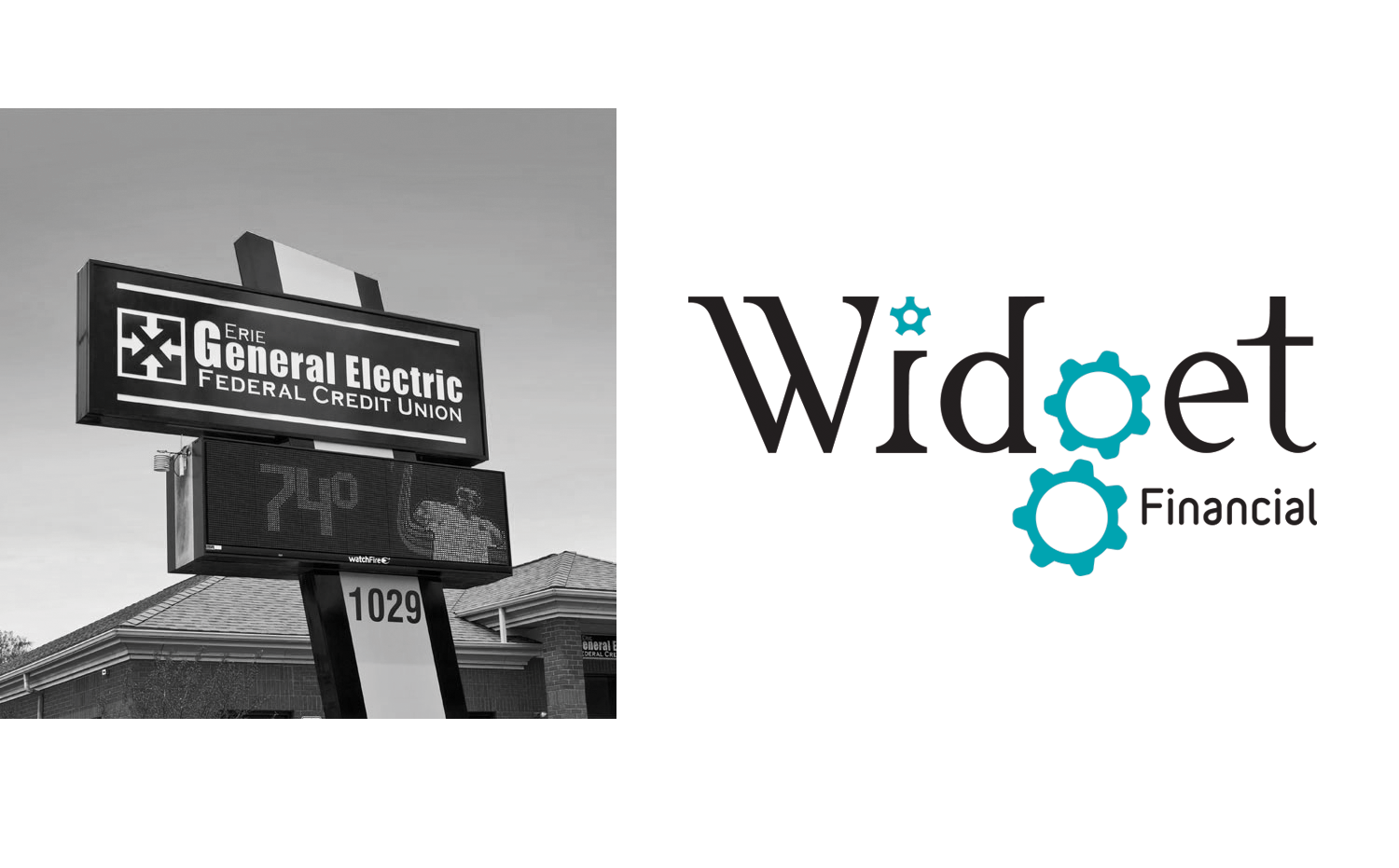
The name change to Widget Financial honored the credit union’s General Electric roots, with “GE” built into the name as a subtle nod to its past.
The launch commercial debuted at Widget Financial’s name reveal event, bringing the new brand to life for the first time.
A New Name, a Modern Brand
The transition to Widget Financial introduced a fresh brand identity paired with a friendly, approachable tone. Together, the new name and visual system created a modern feel that resonated with consumers while maintaining the trust expected of a financial institution.
Since launching the rebrand, Widget Financial has built significant brand recognition and credibility in the marketplace—growing to nearly $500 million in total assets and serving 46,000 credit union members.
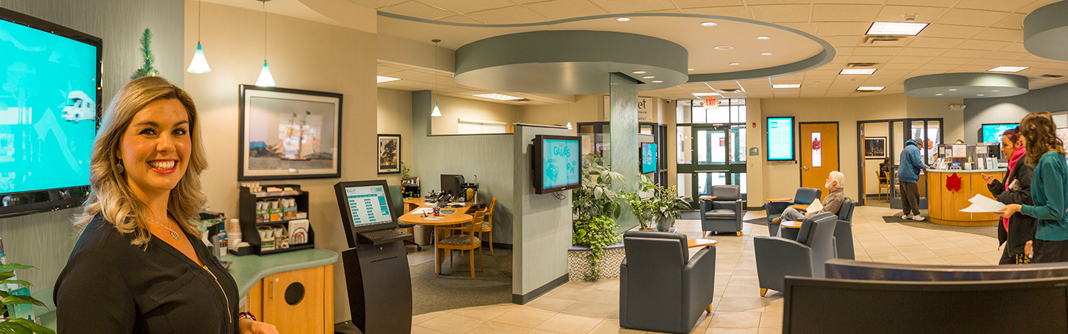
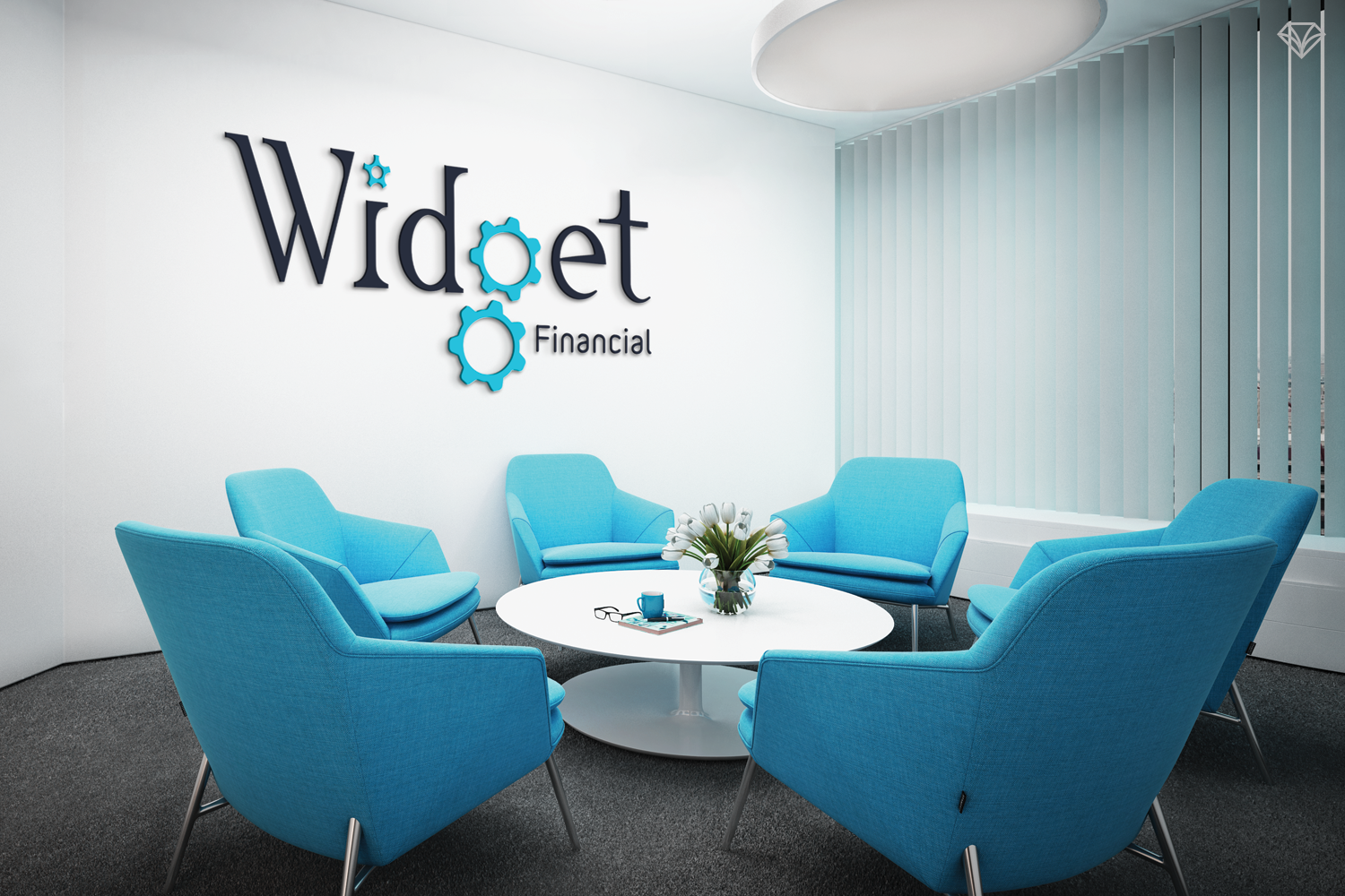
Whether in a branch, on the website, or through media, Widget Financial delivers a seamless brand experience at every touchpoint.
Recognition Fueled by Brand and Service
Widget’s leadership has frequently credited the success of the rebrand—alongside their commitment to delivering top-tier customer service—as a key contributor to the organization being recognized as one of the country’s premier financial institutions across multiple categories.
The brand became not just a new look, but a platform that supported clarity, consistency, and long-term growth.
Scope of the Initial Rebrand
Gem City Creative’s work on the initial rebrand included:
Development of the Widget Financial logo
Multiple launch commercials
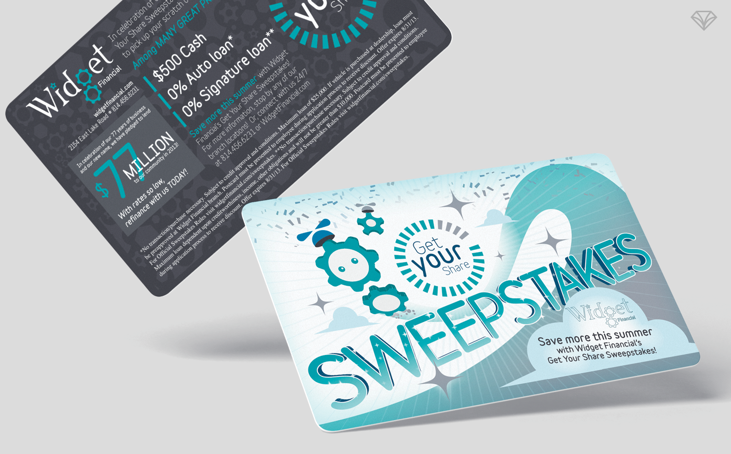
Brochures and a wide range of brand collateral
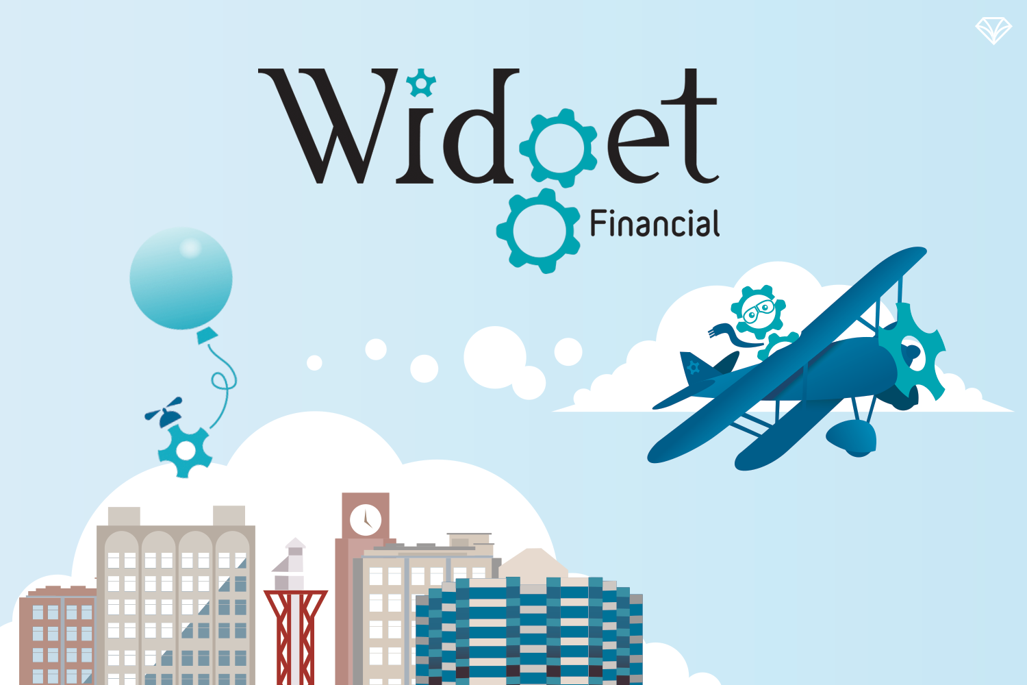
Beyond core assets, Gem City also introduced new character and mascot concepts that would go on to redefine how Widget communicates.
Mascots as a Creative and Strategic Advantage
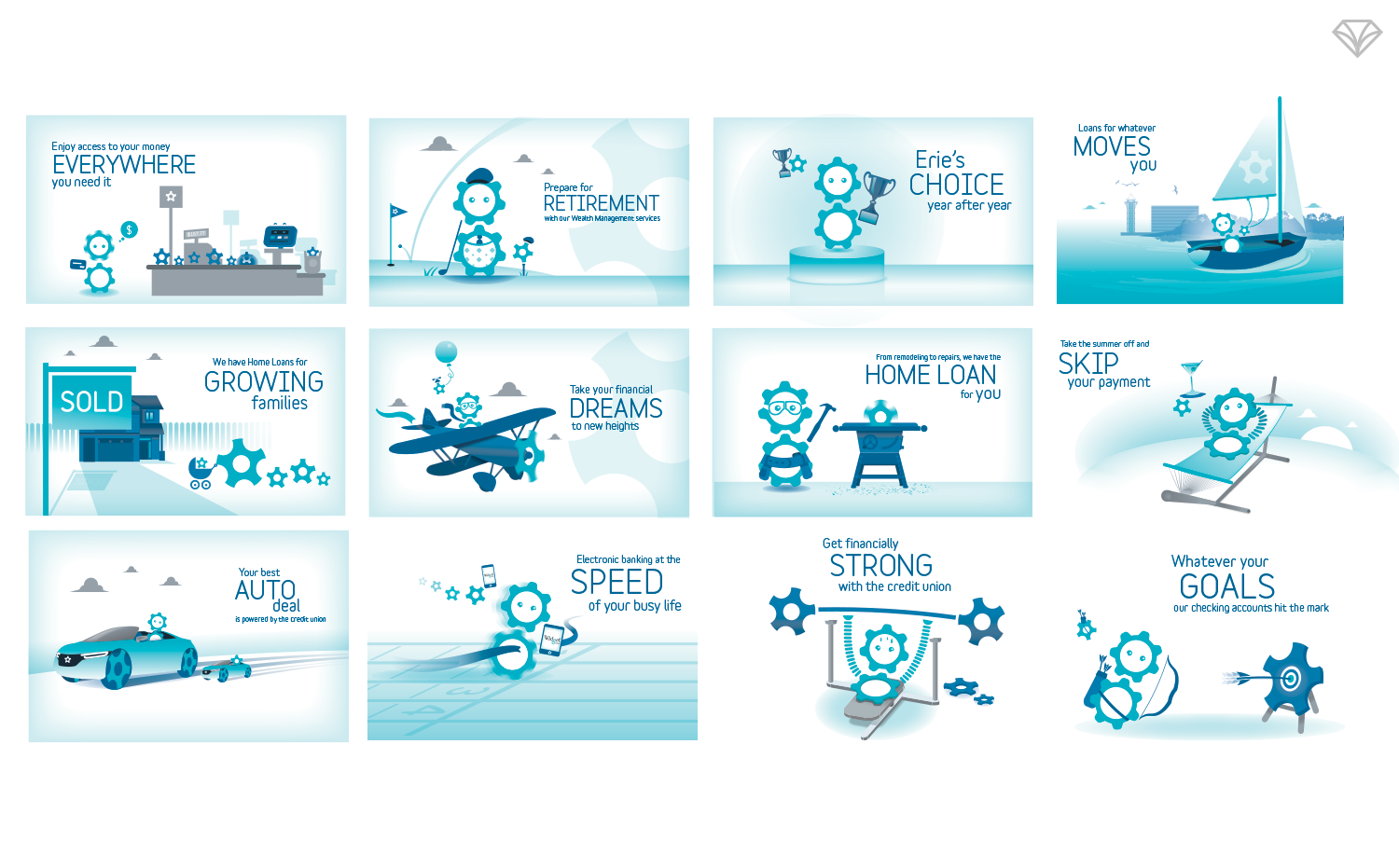
One of the most impactful elements of Widget Financial’s brand system is its mascots—Widgey and Sprok. More than just characters, they have become central to the brand’s success by expanding creative possibilities while solving a critical challenge in financial advertising: compliance.
Because Widgey and Sprok have no defined age, gender, or national origin, they provide a compliant, inclusive, and highly flexible platform for storytelling. This allows Widget to communicate freely within strict federal advertising guidelines—without sacrificing creativity, clarity, or warmth.
The mascots create a flexible, inclusive platform that allows Widget to communicate creatively without limitations.
As the recognizable “face” of Widget Financial, the mascots deliver instant brand recognition and a consistent personality across campaigns. From advertising and digital experiences to in-branch environments, Widgey and Sprok create a nearly unlimited creative canvas that sets Widget apart from its peers while remaining professional, approachable, and consumer-friendly.
More than characters, Widgey and Sprok are strategic brand assets built for long-term use.
A nearly unlimited creative canvas that helps Widget stand apart, powered by Widgey and Sprok.
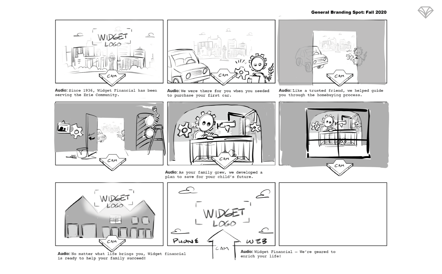
A defining attribute of Widget Financial is their commitment to animation—where each commercial is thoughtfully planned before a single frame is produced.
An Ongoing Brand Partnership
Gem City Creative continues to work alongside Widget Financial as a trusted longterm partner. Our collaboration includes building and supporting multiple sub-brands within the Widget system—ranging from digital advertising and commercials to on-location media such as monitor graphics and ITM screen interfaces.
Widget gave Gem City the opportunity to rebuild their brand from the ground up, and we continue to serve as visual and strategic support as the organization scales. We look forward to continuing this partnership and contributing to Widget Financial’s lasting legacy for decades to come.
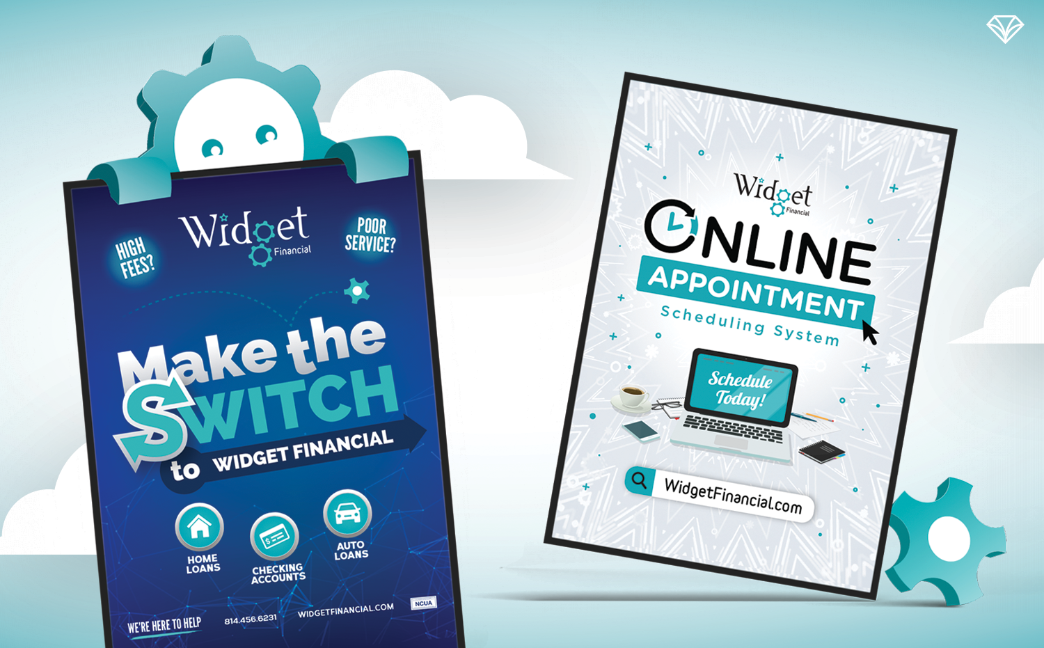
Clean vector graphics and bold shapes create instant recognition across digital and physical environments.
The Challenge: Speed, Scale, and Consistency
As Widget continued to grow, so did its marketing needs.
The credit union requires a high volume of visual assets across digital, physical, and in-branch environments. At the same time, Widget values flexibility—they move quickly, test new ideas, and continually evolve how they show up in the market.
This created a clear challenge:
Widget needed a design partner who could move fast without sacrificing quality, maintain brand consistency across a growing ecosystem, and adapt without constant re-explanation or oversight.
The Solution: A Long-Term Creative Partnership
Gem City Creative serves as Widget Financial’s long-term brand partner, not just a project-based vendor. Because of this relationship, we have a deep understanding of Widget’s brand system, tone, and strategic goals.
That familiarity allows us to:
Deliver fast turnarounds with confidence
Maintain consistency across all touchpoints and sub-brands
Adapt the brand without diluting its equity
Reduce friction for Widget’s internal team
Instead of spending time providing visual references or re-explaining expectations, Widget can assign a project and trust us to jump in immediately—freeing their team to focus on growth and innovation.
Building a Brand System That Scales
From the beginning, Widget’s branding was designed to be flexible, recognizable, and compliant—a critical requirement in the financial industry.
Audience & Location Considerations
Widget serves a broad demographic across seven branch locations throughout Erie County. The brand needed to feel inclusive, accessible, and locally grounded while still modern and professional.
Aesthetics & Visual Language
Widget’s identity relies on:
Clean, bold vector graphics
Minimal photography
Gear-inspired design elements symbolizing progress and reliability
This approach allows the brand to range from playful and illustrative to serious and minimal—depending on context—while still feeling cohesive.
Color, Typography, and Recognition at a Glance
Color Palette:
Black and gray establish trust and stability, while teal and blue introduce approachability and energy. Widget’s teal is especially distinctive—setting it apart from local competitors and making the brand instantly recognizable.Typography:
Corbert, a clean sans serif with subtle personality, ensures readability and consistency across print and digital applications.
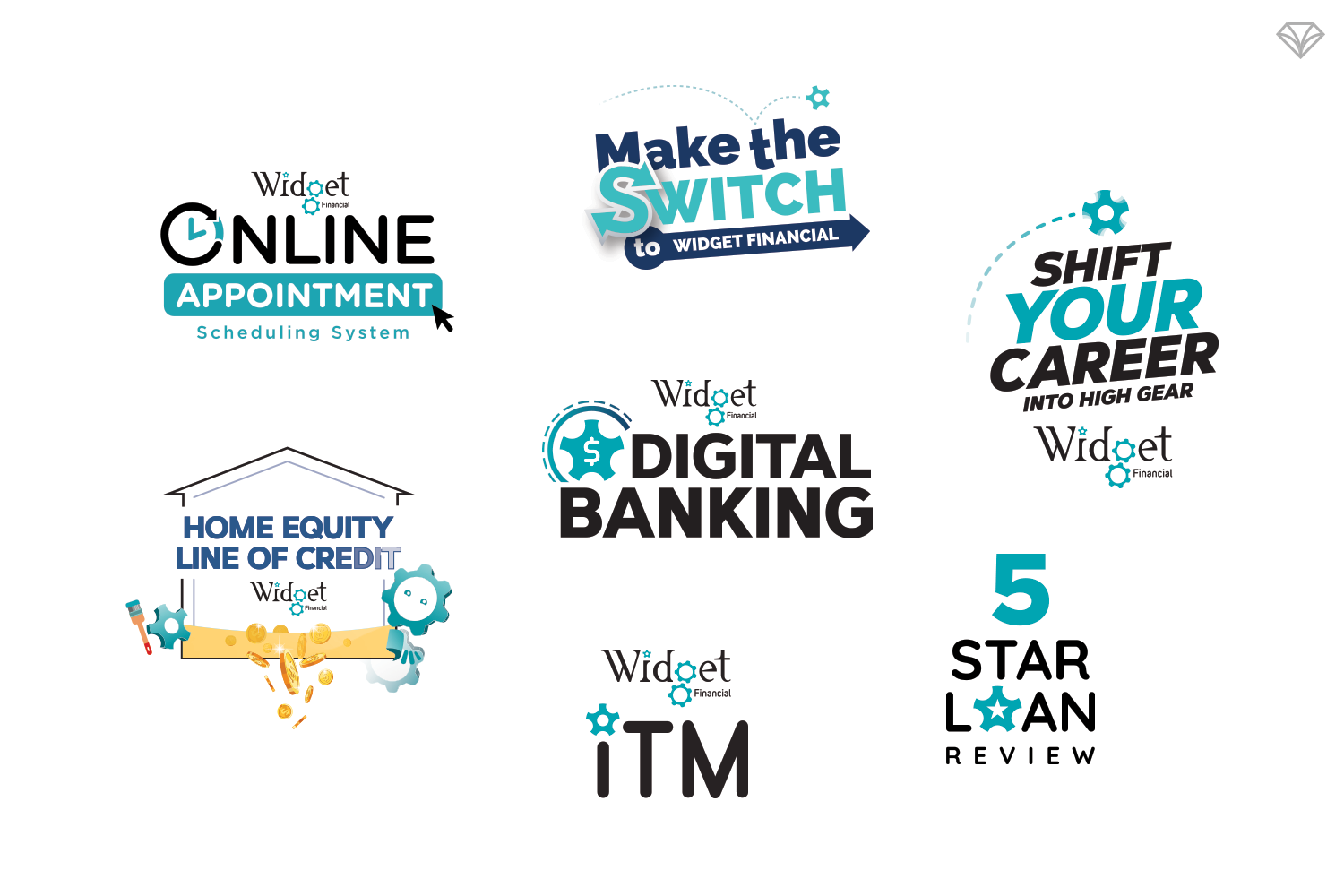
Widget Financial’s brand system balances consistency with flexibility, allowing each sub-brand and campaign to shine on its own.
Deliverables That Meet People Everywhere
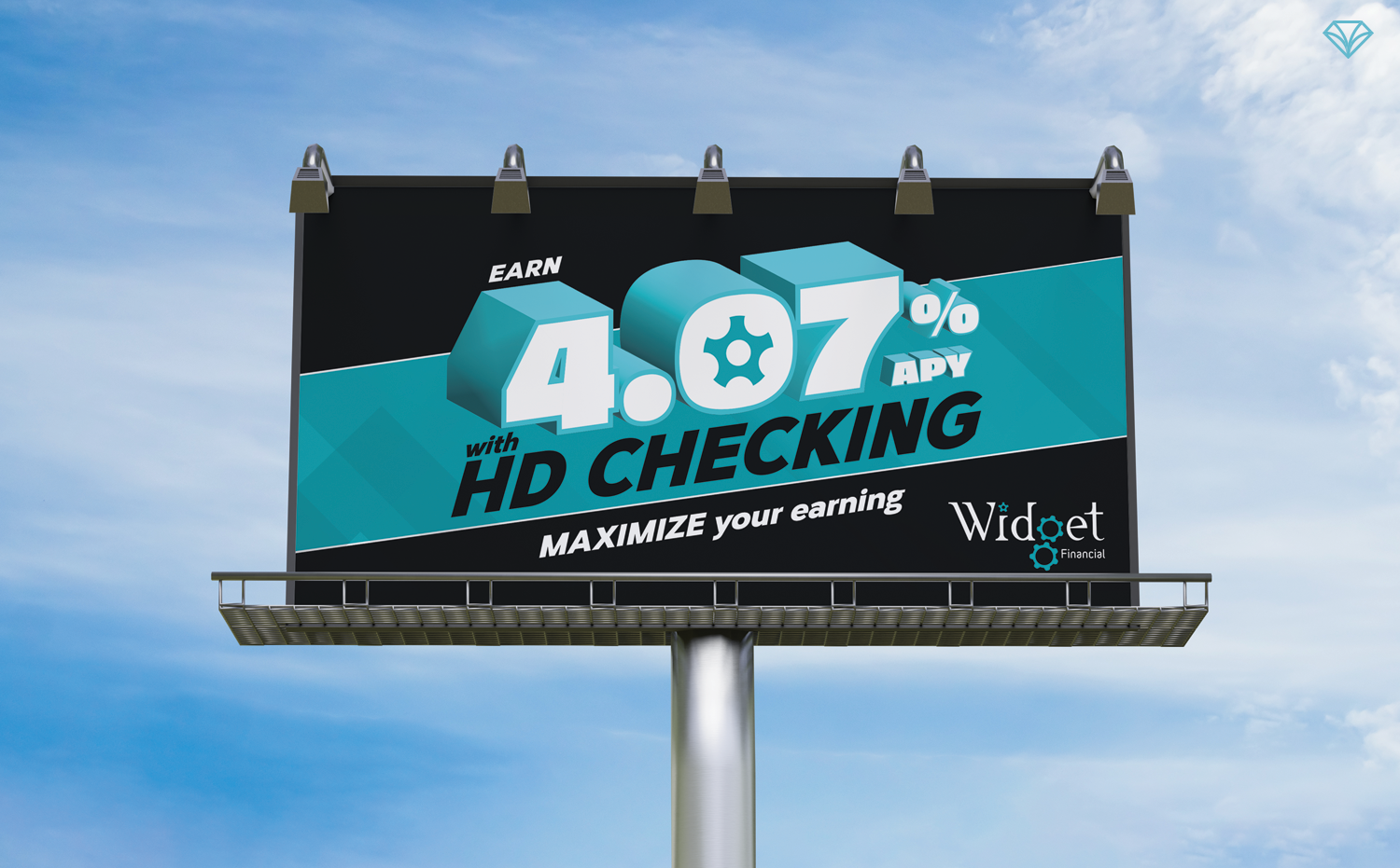
Widget’s brand is visible throughout the Erie region—from Google Ads and billboards to commercials, branch interiors, ITM interfaces, and custom in-branch graphics. Every touchpoint reinforces the same cohesive identity, whether someone encounters Widget online, on the road, or inside a branch.
More Than a Credit Union
Today, Widget Financial is more than a financial institution—it’s a trusted community fixture known for philanthropy, service, and innovation. From its origins as Erie General Electric Federal Credit Union to the thriving brand it is today, Widget’s growth is a testament to what’s possible when strategy, design, and partnership align.
Gem City Creative is proud to have helped build this brand from the ground up—and even prouder to continue supporting Widget as it scales into the future. 💎
Are you curious to know what a brand refresh can do for your company? Send us a message and let’s chat about it!