Designing With Dignity: How Second Harvest Food Bank Built a Flexible, People-First Brand System
When branding works, teams can focus on what matters most.
Food insecurity doesn’t look the same for everyone—but dignity, warmth, and clarity should always be part of the solution. For Second Harvest Food Bank of Northwest Pennsylvania (SHFB), serving the Erie County community goes far beyond distributing food. It’s about access, respect, and meeting people where they are.
As a small but rapidly evolving nonprofit, SHFB needed a brand system that could grow with them—one that supported constant updates, new programs, and emerging initiatives without slowing down their team or diluting their message.
A Growing Organization With a Real-World Challenge
Second Harvest Food Bank provides stable access to food for families, seniors, and individuals across Erie County and surrounding areas. From food drives and food rescue programs to “Fill the Backpack” initiatives and donation events, their reach is broad and deeply rooted in the community.
But as their impact grew, their brand struggled to keep pace.
Their existing materials lacked consistency across imagery, colors, icons, and typography. Updating statistics or program information often meant rebuilding documents from scratch costing valuable time and energy. For potential donors, partners, and stakeholders, this inconsistency made it harder to see just how organized, innovative, and forward-thinking SHFB truly is.
The Goal: Flexibility Without Losing Warmth
Our approach centered on one key idea: build a system, not just assets.
SHFB needed branding that felt:
People-first and approachable
Respectable and polished
Warm, bountiful, and community-driven
Easy to update by a small internal team
The solution had to support change—because change is constant when you’re serving real people with real needs.
Consistency in branding builds trust with donors, partners, and the community.
The Solution: A Brand System Built for Real Life
We created a suite of on-brand Canva templates designed to be flexible, intuitive, and endlessly reusable. Instead of starting from scratch each time, SHFB’s team can now update images, text, and data in minutes…not hours.
This system empowers them to:
Keep materials current as programs evolve
Maintain consistency across all touchpoints
Present themselves confidently to donors and partners
Focus more energy on outreach and community support
In short, the brand now works for them, not against them.
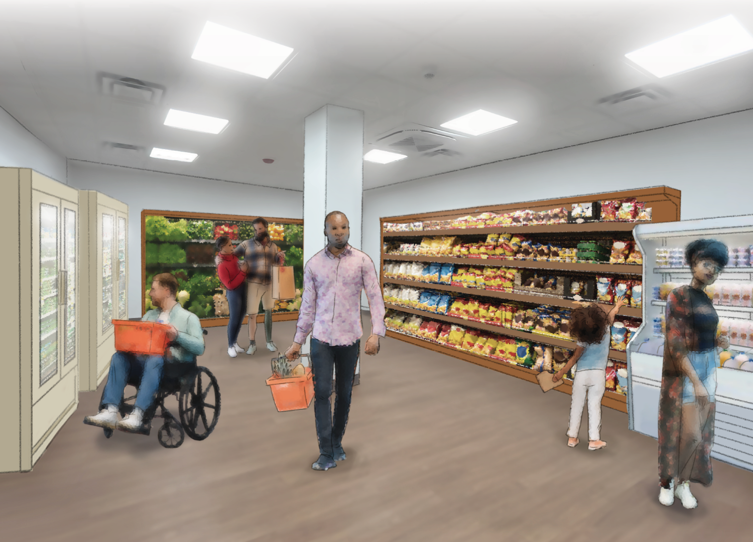
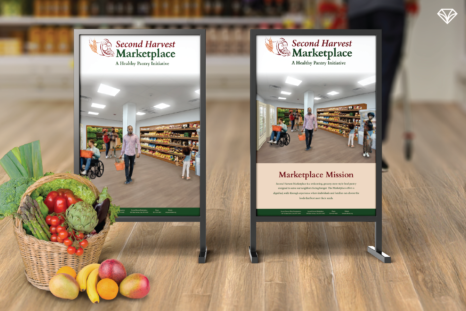
Working from photos of the new vacant space we designed a custom illustration to visualize the upcoming SHFB Marketplace—a dignified, grocery-style experience offering fresh produce and meat
Good design supports innovation, like SHFB’s dignified marketplace concept.
Designing With the Community in Mind
Every design decision was rooted in who SHFB serves and where they serve.
Audience:
Families, seniors, and individuals across all walks of life—many living in food deserts or facing inconsistent access to nutritious food.
Location:
Erie County and surrounding areas, where local farms, food rescue programs, and community partnerships play a critical role.
Aesthetic:
Warm, friendly, and respectful. Clean layouts paired with a cream-toned background (instead of stark white) create approachability, while harvest-inspired accent colors bring vibrancy and meaning.
Visual Choices That Tell a Story
Color Palette: Fall and harvest tones symbolize abundance and nourishment, while a color-coded system helps differentiate programs and pillars.
Imagery: Real photos from food drives, farms, and SHFB initiatives highlight genuine community impact showing both people and the food that sustains them.
Typography: Clear, readable fonts ensure accessibility while reinforcing trust and professionalism.
Clear, scannable layouts make important information easier to understand.
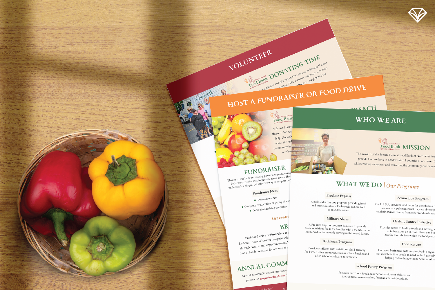
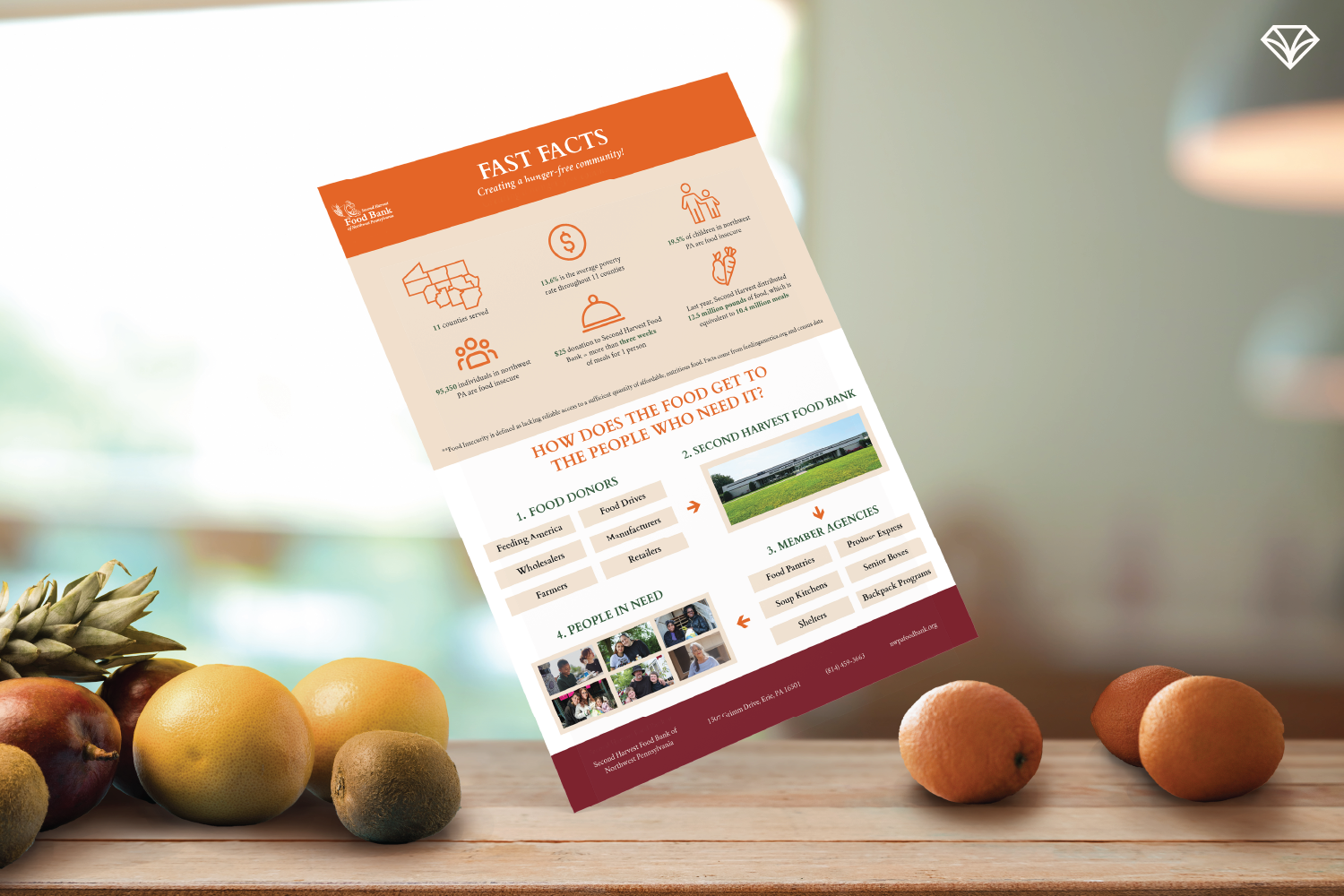
Deliverables Designed for Impact
Because SHFB both serves and relies on the community, their materials needed to clearly communicate purpose and impact. Key deliverables included:
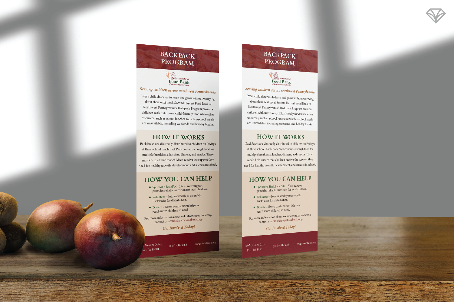
Staggered informational sheets for scannable storytelling
Fast facts cards and sheets to showcase measurable impact
Presentation boards with custom collage-style illustrations to visualize the upcoming SHFB Marketplace—a dignified, grocery-style experience offering fresh produce and meat
Each piece reinforces clarity, respect, and trust.
“The team was wonderful to work with—collaborative, creative, and intentional about ensuring the design aligned seamlessly with our brand identity.”
Why This Matters
Good branding isn’t about looking flashy—it’s about removing friction. For Second Harvest Food Bank, a flexible design system means more time serving people, more confidence when engaging stakeholders, and more momentum toward innovative programs like their marketplace.
This is the power of thoughtful, people-first design: it creates space for organizations to do more of what truly matters. 💎
Are you curious to know what a brand system can do for your company? Send us a message and let’s chat about it!