How Franco’s Rebrand Revived a Local Erie Favorite: A Fresh Take on a Classic Diner

A visual mockup of the new storefront featuring the new logo and tagline “Fresh Food. Good Mood.”
A Fresh Look for an Erie Classic
If you live in Erie, Pennsylvania, chances are you’ve heard of Franco’s—a local favorite known for great food, friendly faces, and a welcoming atmosphere that feels like home. But as the restaurant continued to grow and prepared to relocate to a new, expanded space, one thing wasn’t keeping pace: the brand.
When Franco’s approached Gem City Creative, they saw their move as the perfect opportunity for a fresh start—a chance to modernize their look while staying true to their community roots. The result? A brand refresh that celebrates who Franco’s is today and where they’re headed next.
The Challenge: A Brand That No Longer Matched the Experience
Franco’s branding had evolved over the years without much direction. The outdated branding no longer reflected the warmth of this community-based restaurant. Our goal was to design a restaurant logo that captured Franco’s friendly spirit and timeless appeal.
More importantly, it didn’t capture what makes Franco’s special: the warmth, friendliness, and hometown pride that have always been the heart of the restaurant.
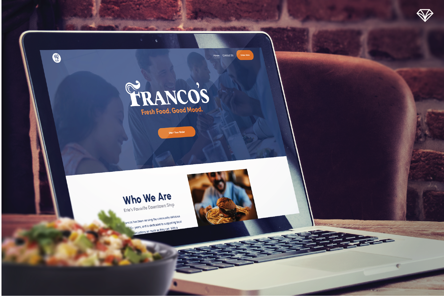
Place an order on the freshly designed www.francosfresh.com
Our Approach: Modern Comfort Meets Local Heart
We knew Franco’s didn’t need to reinvent themselves—they simply needed a brand that reflected who they already were.
So, our design direction focused on three things:
Community Connection: Franco’s is proudly Erie-based. While many restaurants look to expand beyond their hometown, Franco’s plans to grow within Erie—remaining a community anchor.
Customer Experience: The brand needed to feel welcoming, family-friendly, and timeless—just like the dining experience itself.
Scalability: The visual system needed to work across menus, signage, uniforms, packaging, and a new website.
Our goal was to design a brand that welcomes you in—just like Franco’s does.
Design Details That Bring It All Together
Logo:
We reimagined Franco’s original mascot into a typographical mark that’s bold, timeless, and versatile. The new mascot—modern yet nostalgic—pays tribute to the restaurant’s legacy while giving the brand a fun personality.
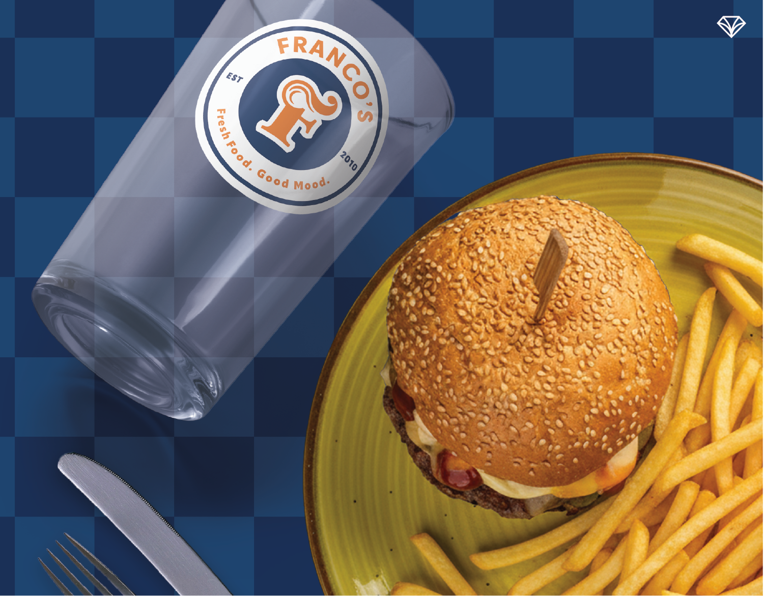
Colors:
Franco’s new color palette is both classic and fresh. Navy and orange provide a strong, complementary base—energized by a citrus yellow and soft gray to balance the intensity. The result is approachable, bold, and memorable.

Every brand identity package we offer comes with a brand guide that keeps your visuals consistent and cohesive across all materials.
Typography:
Inspired by mid-century diner signage, the fonts blend bold serif type with friendly, rounded sans serifs. This pairing brings warmth to the brand while maintaining a clean, modern look.
Patterns & Imagery:
We used subtle checkered patterns that evoke a classic diner feel. Photography is candid, warm, and community-driven—capturing genuine moments that feel like home.
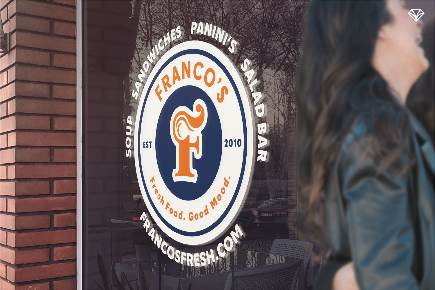
Franco’s logo badge design offers flexibility for a wide range of applications.
The Final Touches: Menus, Website & More
We designed menus that reflect the charm of a traditional diner but with a modern, organized layout. A simple food illustration on the cover adds character without overwhelming the design.
The website carries the new visual language online—emphasizing accessibility and promoting Franco’s online ordering system. It’s built to grow with the restaurant as they expand locally.

The menu design captures the restaurant’s classic charm with a fresh, modern touch.
Why It Works
This rebrand gives Franco’s a cohesive identity that’s both rooted in Erie and ready for the future.
It tells a clear story—one of community, comfort, and great food. And for a restaurant that has long been part of Erie’s downtown heartbeat, that story finally shines through in every detail. 💎

We retained key parts of the original brand, like the mascot, which was refined for a cleaner and more adaptable design.
Looking to refresh your brand?
Gem City Creative helps businesses like Franco’s transform their identity into something that resonates with both new and loyal customers.
👉 Contact us to learn how we can help your brand reflect your story.