How Strategic Brand Messaging Helped Heberle’s Heartstrings Amplify Music Access in Erie and Beyond
Music has the power to connect, heal, and transform communities. In Erie, one nonprofit is proving that access to music can change lives.
Heberle’s Heartstrings is more than a lending library for instruments. It is a community-driven organization committed to making music inclusive, accessible, and joyful for people of all ages and backgrounds. From providing instruments to those who cannot afford them to hosting an annual open mic competition that uplifts underground artists, the organization is building something bigger than programs. They are building opportunity.
But as their impact expanded, their brand needed to catch up.
This is the story of how strategic brand messaging, visual consistency, and clarity created a stronger foundation for growth.
The Mission: Inclusive and Accessible Music for All
Heberle’s Heartstrings was founded in memory of Jason Heberle, whose passion for supporting local musicians continues to shape the heart of the organization. His legacy lives on through:
A musical instrument lending library
An annual open mic music competition with significant prize opportunities
A long-term vision for a physical community hub with practice and recording rooms
Future school programming to ensure students can participate in band and extracurricular music programs regardless of financial barriers
Their mission is simple but powerful: everyone deserves the chance to explore music.
The challenge was not a lack of heart. It was a lack of brand clarity.
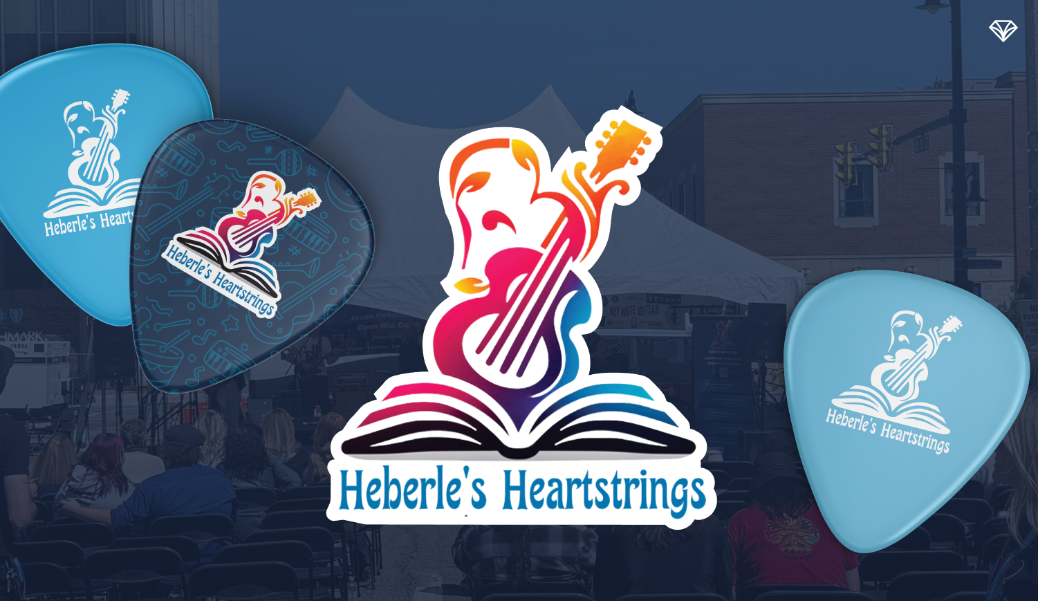
Connecting the tagline to the logo helps communicate what Heberle’s Heartstrings stands for at a glance
The Challenge: Inconsistent Branding and Unfocused Messaging
Heberle’s had built meaningful programs and strong community engagement. However, their messaging and visual identity were inconsistent across platforms and over time.
Key challenges included:
Messaging that did not fully balance emotional storytelling with clear explanation of services
Visual inconsistency across materials
Overcomplicated collateral that diluted key information
Website navigation that could benefit from simplification
No unified brand guide for future growth
As the organization looked toward expansion in Erie and eventually nationwide, they needed a clear, scalable brand foundation.
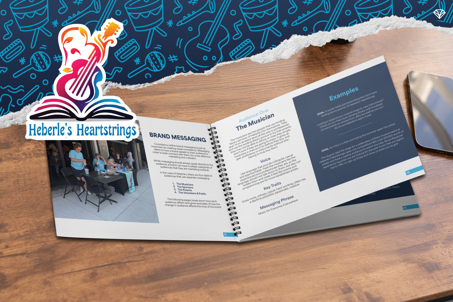
The Strategy: Brand Audit, Audience Clarity, and Messaging Refinement
Our work began with a meticulous brand audit.
We analyzed existing assets, language patterns, user journey touchpoints, and visual consistency. From there, we identified four primary audience personas:
Lower-income individuals seeking access to instruments
Parents supporting aspiring young musicians
Local artists looking for performance opportunities
Community partners and donors
Each persona required intentional voice and tone guidance. Inclusivity remained central, but clarity became the differentiator.
We refined messaging to:
Clearly articulate what Heberle’s does
Highlight the emotional core of Jason Heberle’s legacy
Explain programs in straightforward language
Emphasize community impact and long-term vision
The result was messaging that felt both heartfelt and strategically focused.
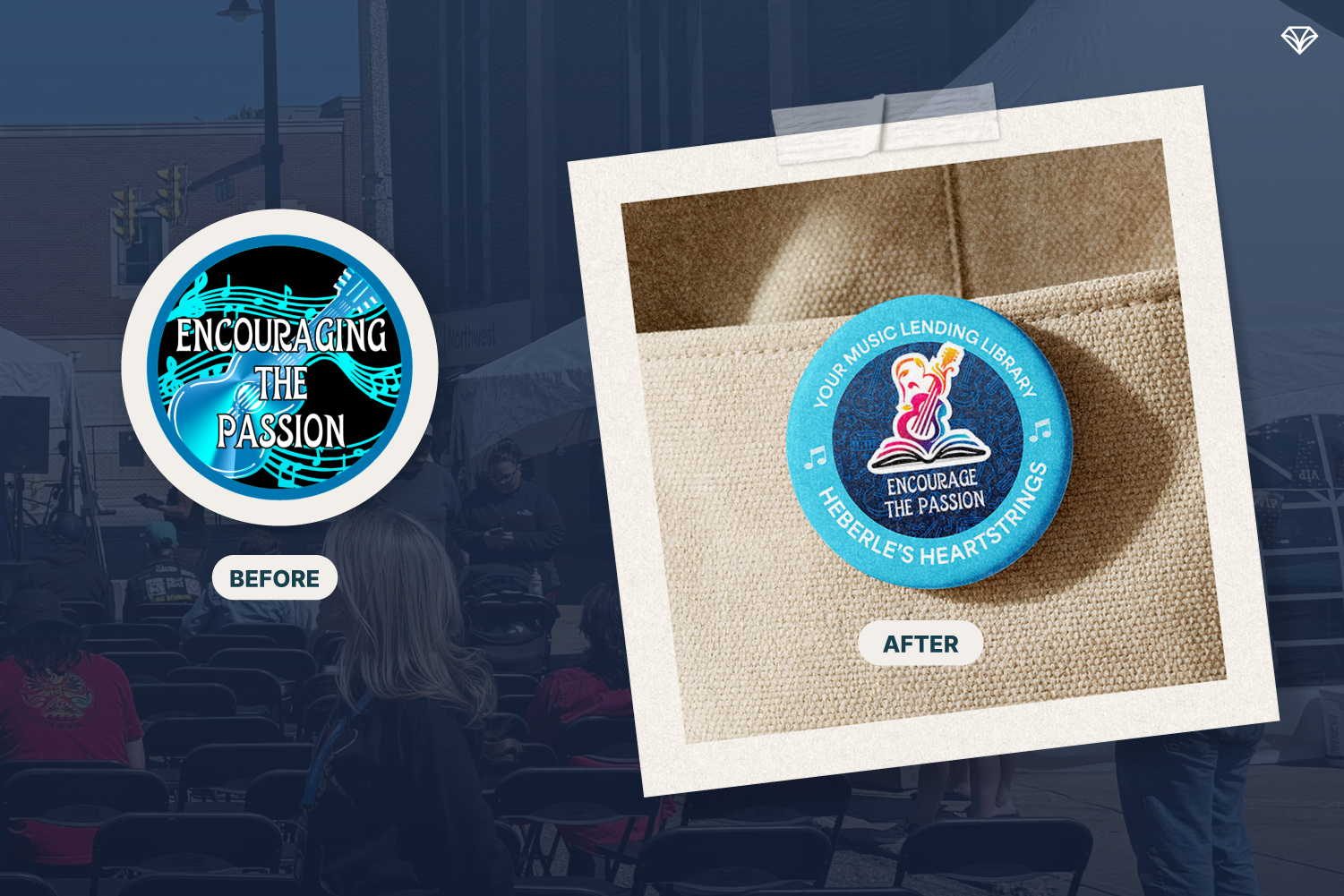
A brand guide provides clarity and instruction so messaging and visuals stay consistent
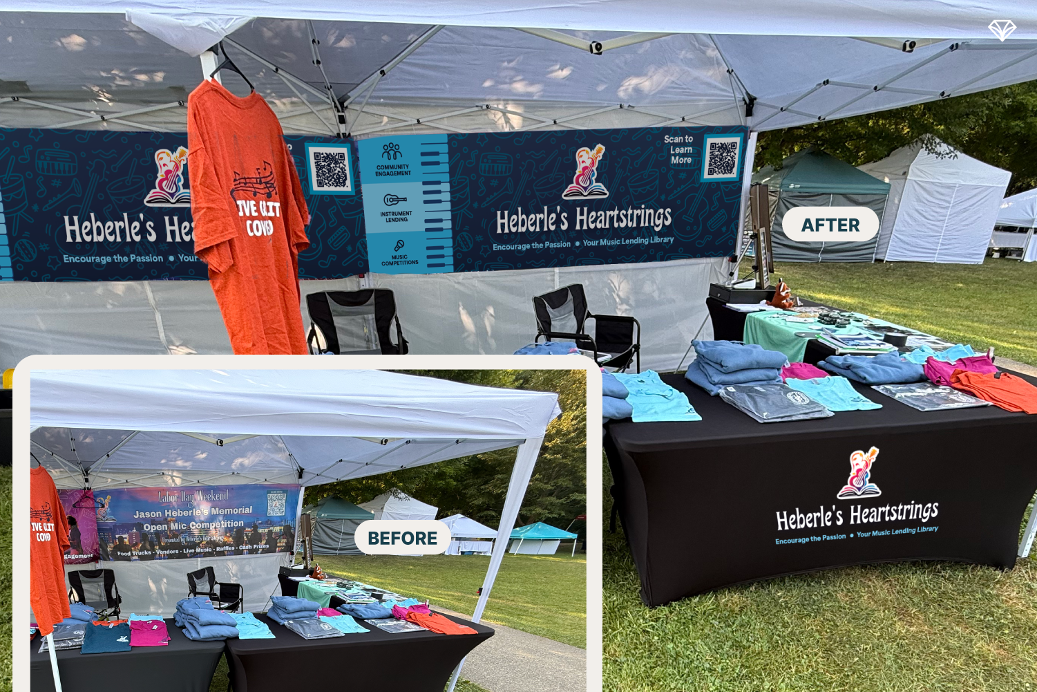
The Visual Identity: Simplified, Consistent, and Joyful
Brand clarity does not stop at words. Visual consistency reinforces trust.
Color Palette
Previously, colors varied widely across materials. We established a defined, consistent color palette based on existing collateral. This preserved the joyful and vibrant spirit of the brand while eliminating confusion.
Typography
The original title font remained. To support flexibility, we introduced clean subtitle and body fonts with multiple weight options. This created visual hierarchy and improved readability across print and digital platforms.
Collateral Redesign
To bring the brand guide to life, we redesigned select existing materials according to the new standards. These real examples serve as practical templates for future content creation.
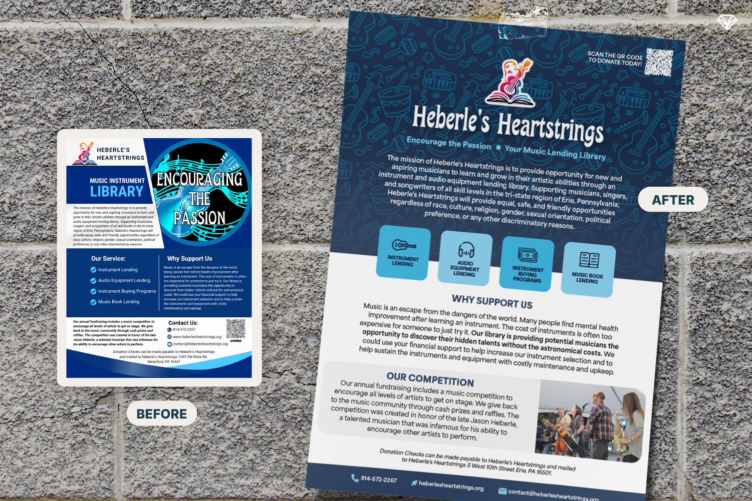
Message hierarchy guides the eye from the most important details to the supporting ones
The Outcome: A Scalable Brand Foundation
The final deliverable was a comprehensive brand guide that included:
Voice and tone guidelines
Defined audience personas
Messaging examples
Visual standards
Color and typography systems
Application examples
The guide is clear, navigable, and designed for real-world use by team members at any level.
Now, Heberle’s Heartstrings has:
Consistent messaging across platforms
A unified visual identity
Simplified and optimized collateral
A scalable foundation for future expansion
As they move toward a physical music hub and expanded school programming, their brand now matches the strength of their mission.
Clear messaging creates stronger impact
Why Brand Strategy Matters for Nonprofits
Nonprofits often lead with passion. But passion without clarity can limit growth.
Strategic brand messaging does not remove heart, it gives the brand a strong foundation from which the message can be amplified.
For Heberle’s Heartstrings, clarity means:
Greater recognition
Stronger empathy from the community
Easier onboarding of volunteers and partners
A replicable model for other cities
They are not just lending instruments. They are creating access. They are building community. They are honoring a legacy.
And now, their brand tells that story clearly.
“Amazing Team, Fast and High Quality Work. This company is THE company you want to talk to.”
Are you curious to know what a brand refresh can do for your company? Send us a message and let’s chat about it!