
Brand Strategy, Design & Marketing Insights
Find your industry:
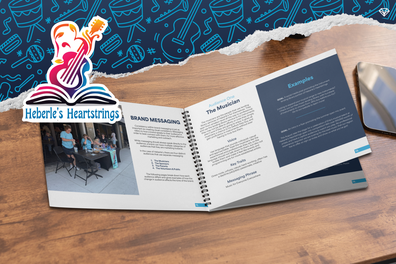
How Strategic Brand Messaging Helped Heberle’s Heartstrings Amplify Music Access in Erie and Beyond
Heberle’s Heartstrings, a nonprofit in Erie, provides inclusive access to musical instruments and performance opportunities for people of all backgrounds. As the organization expanded, inconsistent messaging and visuals limited their impact. Through a comprehensive brand audit, refined audience personas, strategic messaging, and a cohesive visual identity, we helped create a scalable brand foundation. The result is a clear, consistent, and joyful brand guide that supports growth, community engagement, and future expansion into physical spaces and school programming. Now, Heberle’s brand reflects the strength of its mission and the legacy that inspired it.
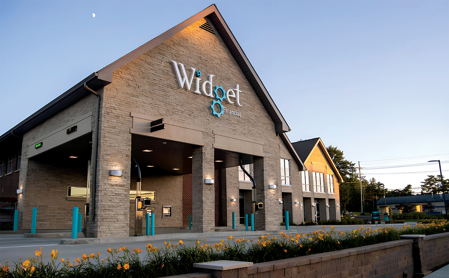
How a Strategic Rebrand Helped Widget Financial Build Trust and Accelerate Growth
Widget Financial’s rebrand marked a turning point—from a locally recognized credit union to a modern, trusted financial institution with nearly $500M in assets and 46,000 members. Gem City Creative partnered with Widget to create a flexible brand system built for speed, consistency, and growth. Through strategic design, distinctive mascots, and a scalable visual language, Widget gained instant recognition and creative freedom—without sacrificing compliance. This long-term partnership allows Widget to evolve confidently while staying focused on what matters most: serving its community and moving the organization forward.
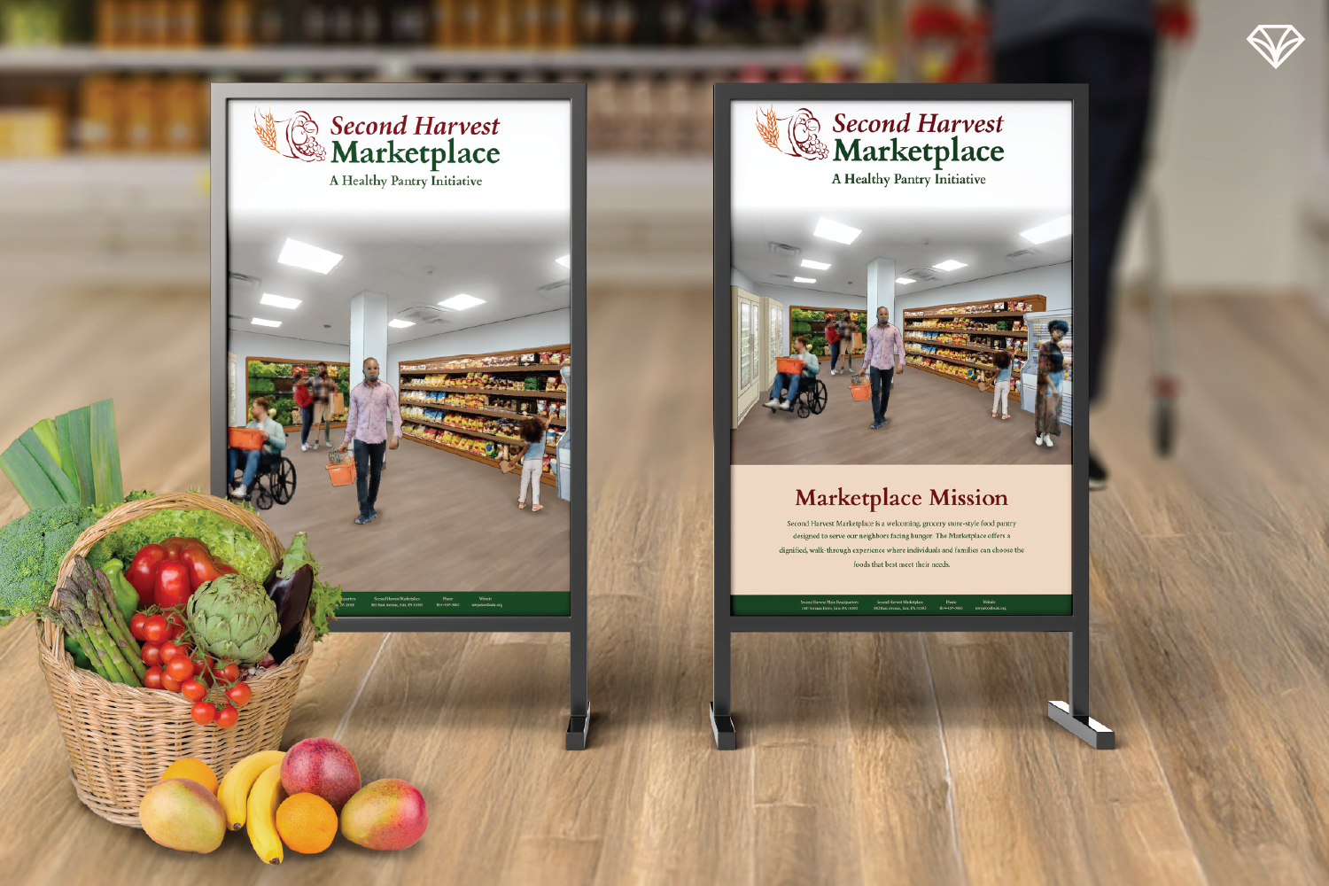
Designing With Dignity: How Second Harvest Food Bank Built a Flexible, People-First Brand System
Second Harvest Food Bank needed a brand system that could grow with its evolving programs while maintaining warmth, dignity, and consistency. As a small nonprofit serving Erie County and surrounding areas, outdated and inflexible materials were costing valuable time and clarity. By creating an adaptable Canva-based design system, SHFB gained the freedom to update materials quickly without sacrificing polish or trust. Rooted in people-first values, harvest-inspired colors, and real community imagery, the refreshed brand supports both outreach and innovation allowing SHFB to focus on what matters most: providing stable, respectful access to food for the community.
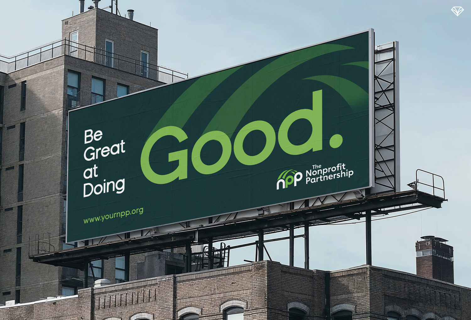
Building Bridges Through Branding: How NPP’s Visual Identity Reflects Its Mission
When a nonprofit partnership approached Gem City Creative, they needed more than a logo refresh—they needed clarity. Their existing identity lacked meaning and caused confusion with another local nonprofit. Through discovery sessions, we uncovered their core role as a connector—advancing best practices, fostering relationships, and strengthening the nonprofit sector. That insight led to a bridge-inspired brand concept rooted in connection and community. By translating strategy into a meaningful visual identity and showing the logo in real-world contexts, the final brand tells their story with confidence. The result is a collaborative, purpose-driven identity built to serve them for years to come.