Erie Trails Brand Refresh: Turning a Regional Parks System into an Everyday Adventure
There’s a good chance you’ve driven past a park in Erie without realizing what was there.
Not because it wasn’t worth visiting, but because nothing pulled you in.
That’s the challenge Erie Trails set out to solve.
The Hidden Problem Behind Great Parks
Erie Trails, formerly known as Greater Erie Trails (GERT), had something many organizations wish they had: incredible natural assets. It had it all—trails, parks, lake views, and outdoor experiences for every type of person.
But awareness was low, and the brand didn’t reflect the scale of the vision.
Their identity worked in formal settings, but it wasn’t built to inspire families or attract new visitors. It deserved far more recognition than it was getting.
The Goal: Make the Outdoors Feel Like an Invitation
Erie Trails wanted to shift perception.
From “just another park system”
To something that felt connected, easy to navigate, and worth exploring year-round.
That meant creating a brand that could:
Stand out instantly
Scale across signage, events, and digital platforms
Connect with both adults and families
Adapt as the system grows
It needed to show up clearly, wherever people found it.
Building a Brand That Moves
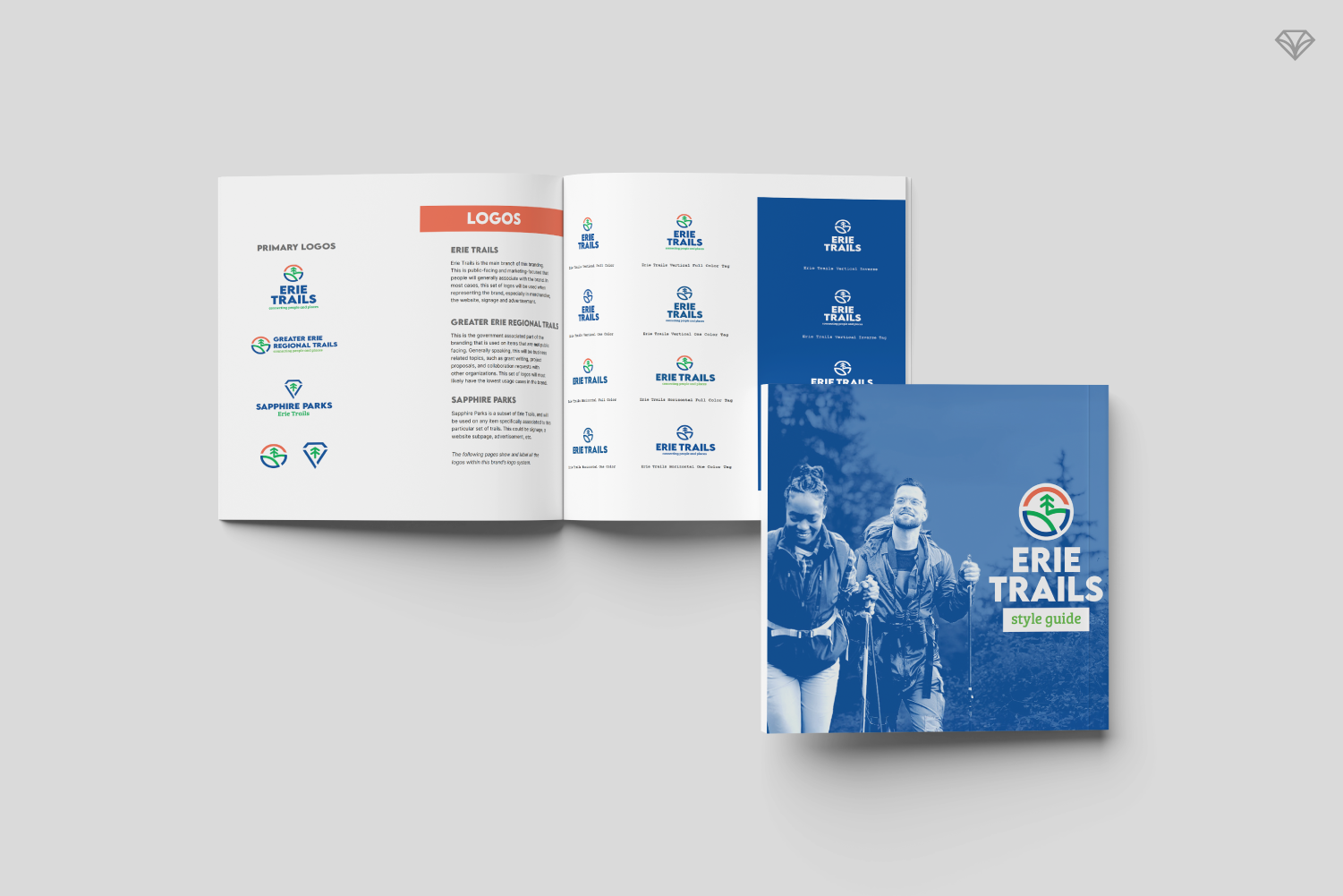
We started with the foundation: a bold, badge-style logo designed to feel recognizable at any size.
From there, we built a full identity system around it.
A color palette of burnt orange, cobalt blue, and grass green represents the core elements of nature: sun, water, and land. Beyond aesthetics, these colors serve a functional role by helping users quickly understand maps and signage.
Typography was chosen with intention:
A sharp, modern sans serif for strong headlines
A friendly serif to add warmth in storytelling and family-focused materials
A highly versatile body font to support clarity across all formats
Every decision balanced personality with usability.
Because a brand like this doesn’t just live on screens; it lives on trails, signs, brochures, and booths.
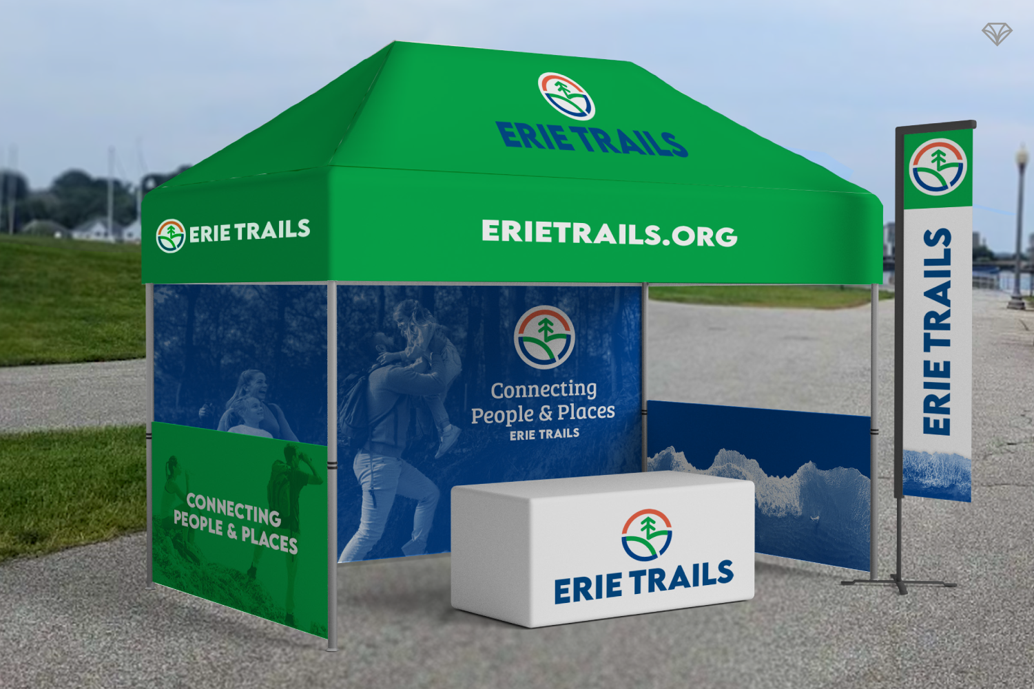
Designing for Real-World Use
This wasn’t just about creating a look; it was about building a system that works.
Erie Trails needed:
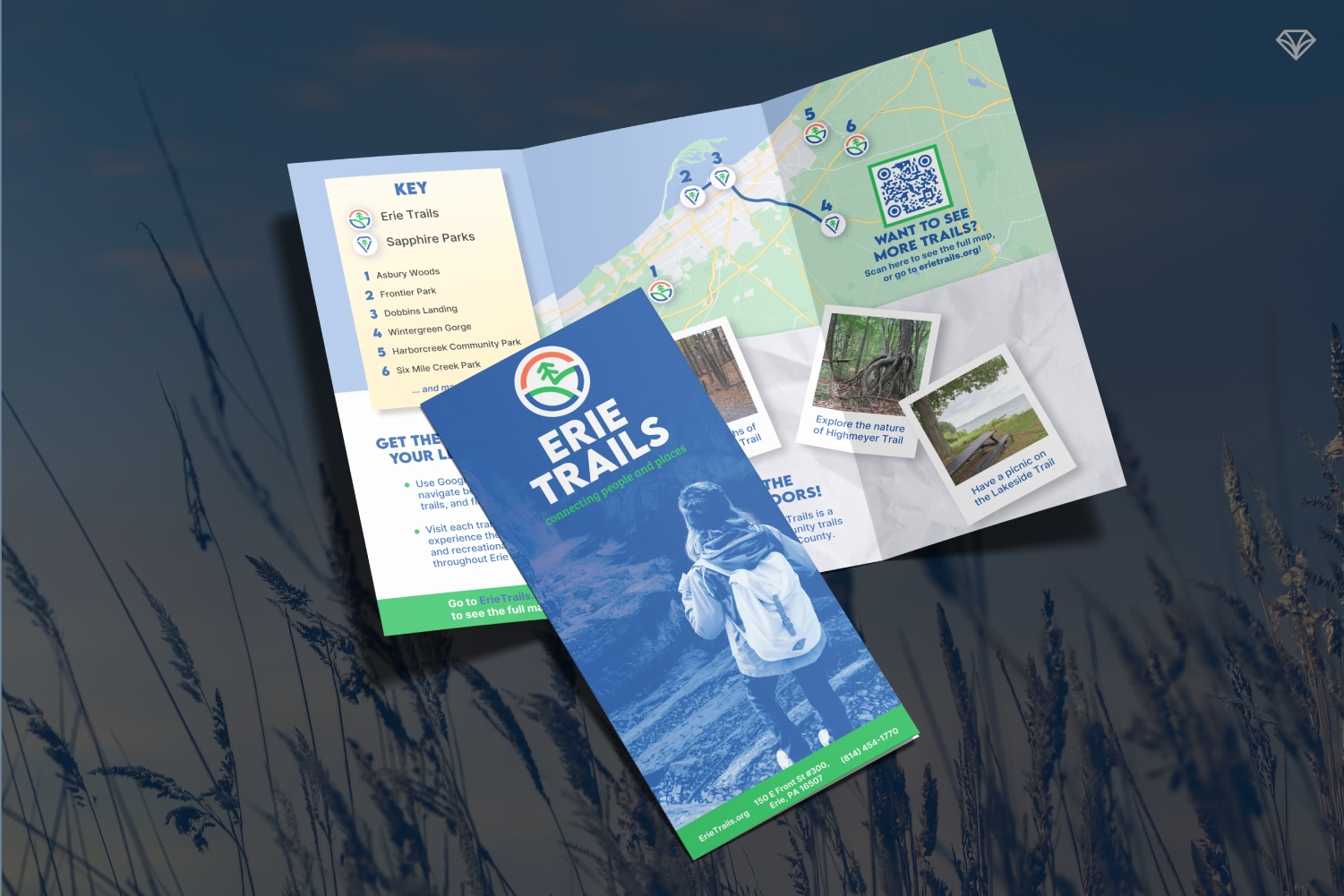
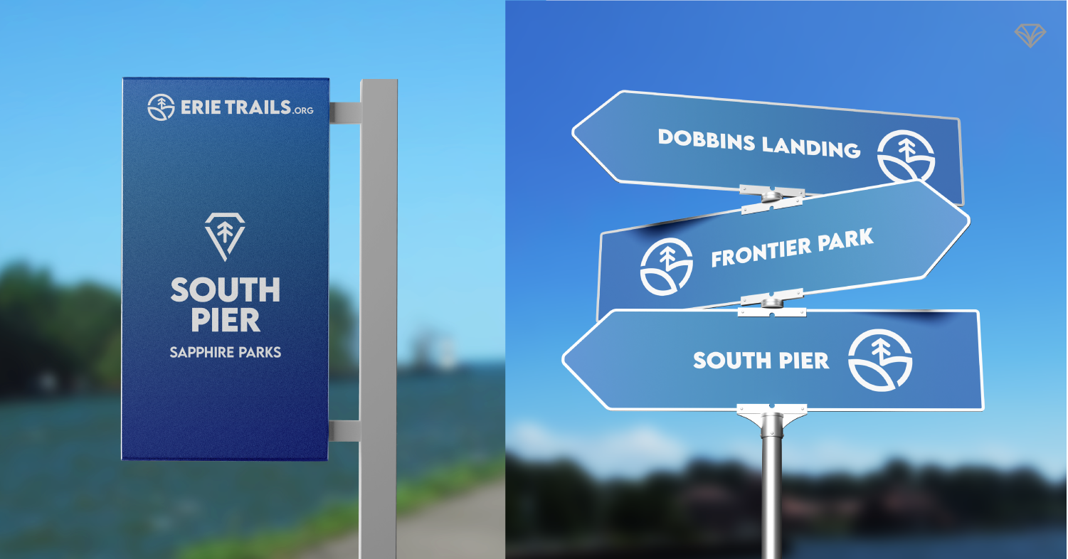
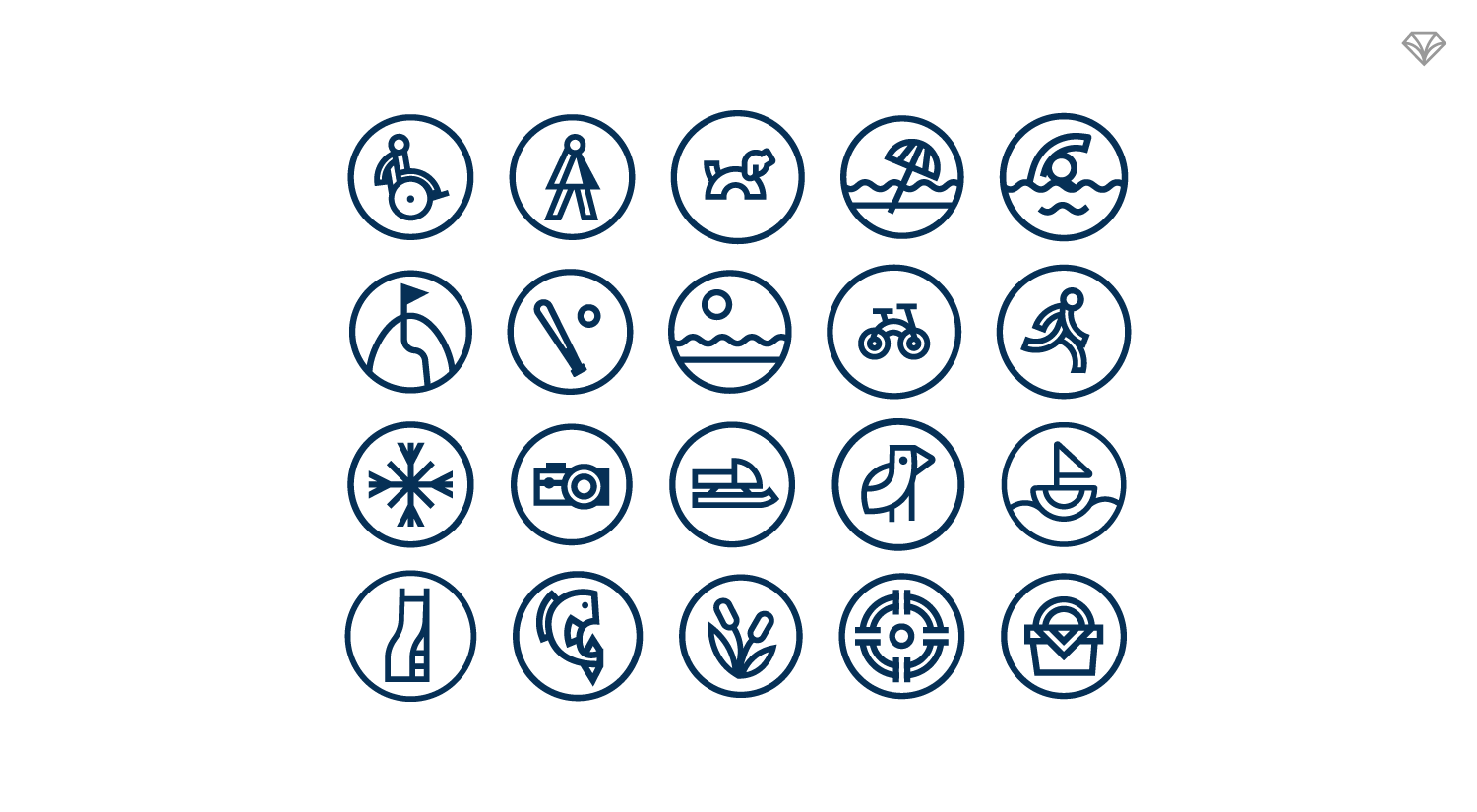
Wayfinding signage that could be understood in seconds
Icons to communicate activities at a glance
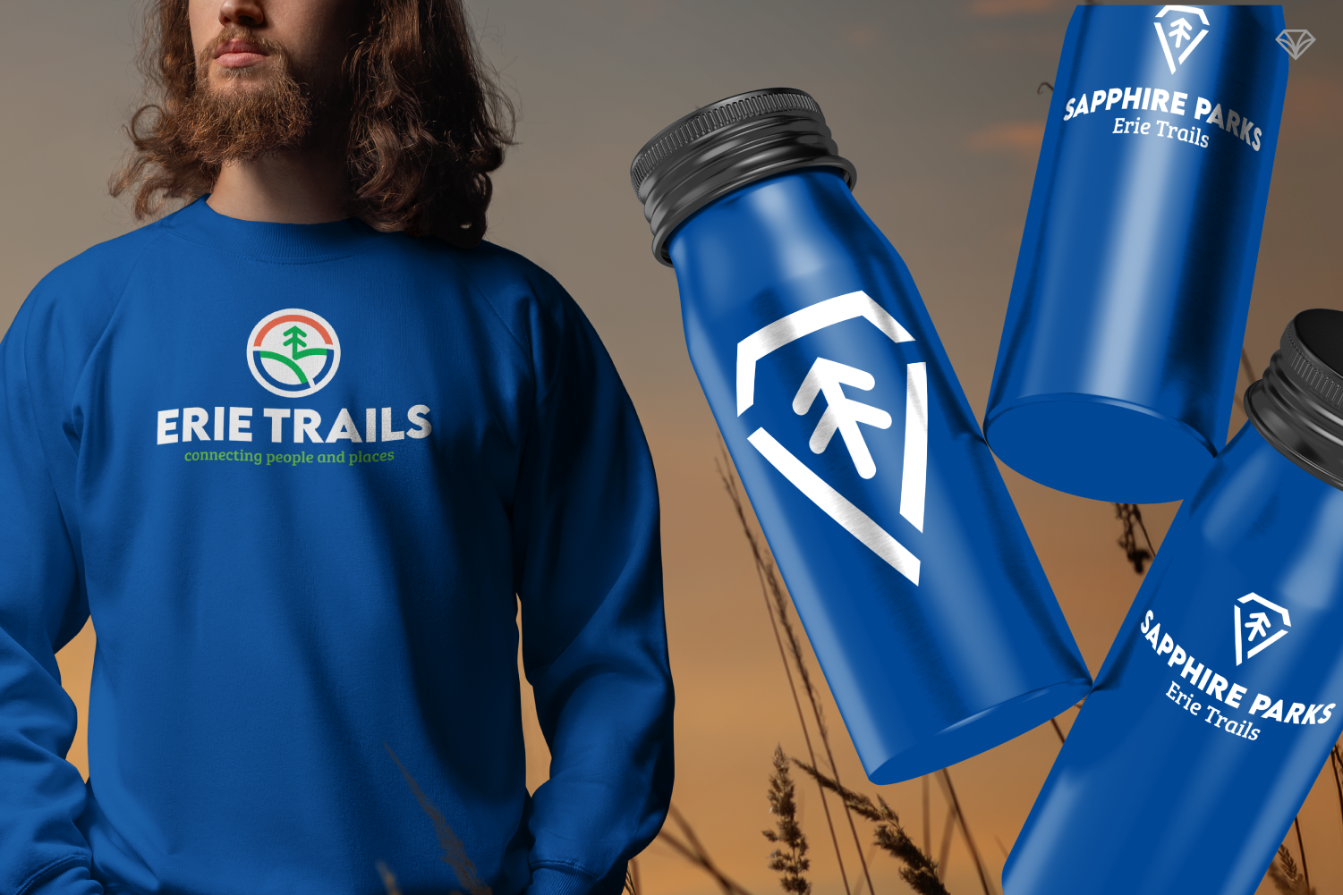
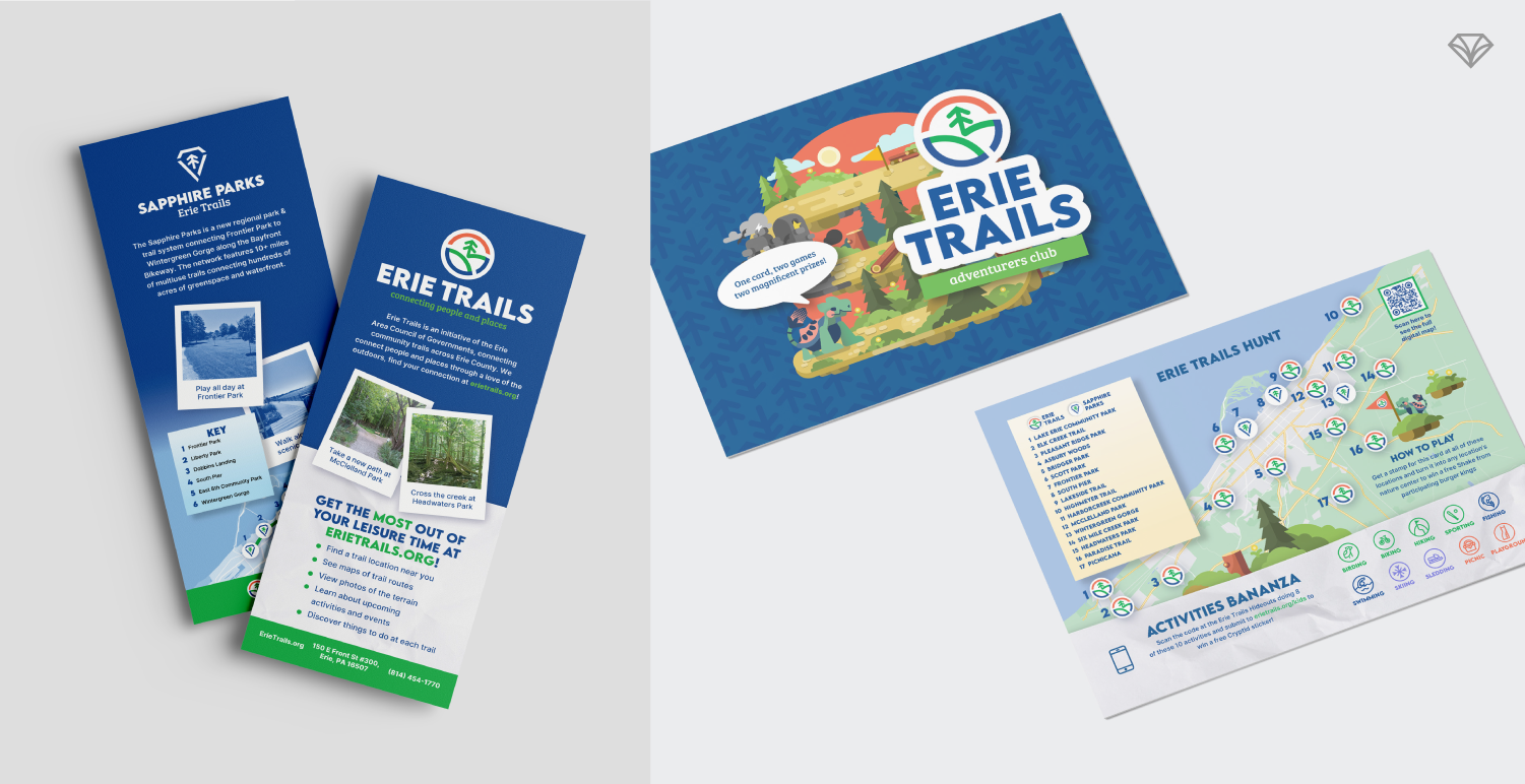
Sub-brands for different trail systems like Sapphire Trails
Materials for events, outreach, and education
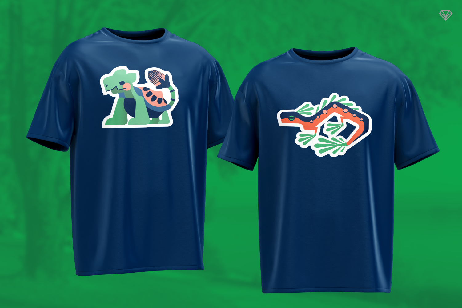
Kid-friendly experiences that make outdoor exploration fun
So we designed everything to work together.
Custom icons help visitors quickly identify activities like hiking, fishing, or picnicking. Signage was simplified for fast readability whether someone is walking, biking, or driving. Sub-brands maintain consistency while giving unique areas their own identity.
And for families, we introduced a playful layer—complete with illustrated mascots and a punch card system that turns park visits into an adventure.
A System Built to Last
A brand this expansive can’t rely on static files.
That’s why we built the majority of assets as flexible templates. Erie Trails can now update signage, marketing materials, and outreach tools without starting from scratch.
This keeps the brand flexible as the organization develops.
The Bigger Picture
This wasn’t just a brand refresh.
It was about turning a regional parks system into an everyday adventure people actually see, understand, and step into.
By making Erie’s parks more visible and engaging, Erie Trails is helping more people rediscover what’s been there all along.
Because sometimes the difference between “overlooked” and “unmissable” isn’t the place itself.
It’s how it’s brought to life. 💎
Are you curious what a brand refresh could look like for your organization, and the impact it could have on awareness, engagement, and growth?