How FERVELL Is Redefining What a Modern CPA Firm Looks Like

Kyle and Ryan needed a brand that felt premium, trustworthy, and forward-thinking.
How FERVELL Is Redefining the CPA Experience Through Education & Innovation
Most CPA firms focus on paperwork, filing deadlines, and transactional tax services. FERVELL was built to do more. Founded by experienced CPAs Kyle and Ryan, this modern advisory firm pairs premium tax services with hands-on education—so clients don’t just file taxes, they learn how to use them to their advantage.
A CPA Firm That Puts Vision First
FERVELL exists to help clients look ahead, not backward. Their approach empowers people to gain clarity, confidence, and control over their finances—whether it’s a small business, personal taxes, real estate, or an emerging side hustle.
Their innovative tiered package system allows clients to start at the level they need today and climb toward proactive tax strategy over time. Every tier unlocks more clarity, more education, and more long-term financial vision—helping clients reach the “peak” of their goals.
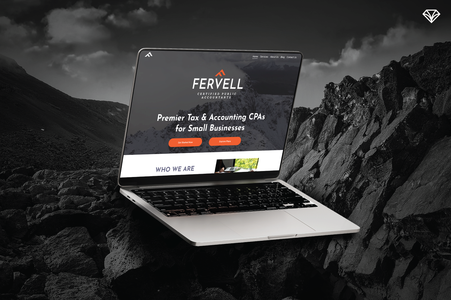
The website we created highlights FERVELL’s premium brand while guiding clients effortlessly through their services.
Solving a Key Industry Gap: Trusted Partner + Disruptive Innovator
Kyle and Ryan faced a challenge:
How do you offer premium, cutting-edge tax advisory without alienating people who feel lost or intimidated by money?
They chose to balance both worlds:
Disruptive enough to elevate the industry.
Grounded enough to remain a trusted partner.

Trust was key, so we highlighted client feedback in a visually striking way.
A Brand Identity That Reflects Elevation + Sharp Innovation
To communicate this dual identity, we built the brand around the concept of vision—symbolized by a mountain peak. It represents growth, elevation, and the confidence that comes from finally seeing the path ahead.

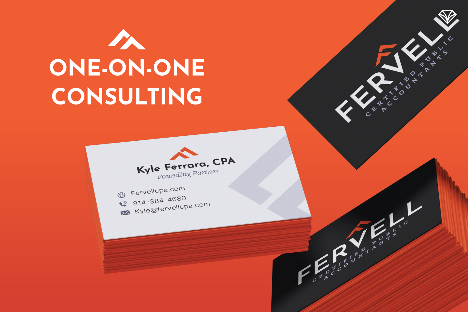
The logo icon cleverly combines an angled ‘F’ and an upside-down ‘V,’ representing both CPAs’ last names, while also forming a mountain-like shape to symbolize growth and vision.
We chose a monochromatic color palette of soft grays to create a premium, professional aesthetic, and paired it with a bold orange accent. This splash of color brings energy to the brand and highlights the innovative, modern side of FERVELL. The typography also supports this dual concept. The primary font is a sharp, modern sans serif that aligns with the firm’s cutting-edge positioning, while the secondary font introduces a more approachable contrast to maintain clarity, warmth, and readability.
We crafted the brand to strike the perfect balance between premium sophistication and approachable warmth.
Imagery plays a large role in setting the tone of the brand. We leaned into visuals that feel professional, minimal, and confident. Rather than using cliché finance stock images, the imagery focuses on the idea of consulting and clarity—showing people in natural, realistic office settings, but without relying heavily on faces. The mountain-inspired textures and black-and-white photography help reinforce the feeling of elevation, luxury, and forward vision.
This blend creates a brand that feels premium, educational, and empowering.

The goal was to convey FERVELL’s brand essence in a single, powerful image that conveys both growth and innovation.
Made for Real People With Real Financial Goals
FERVELL was designed for people who want clarity and confidence when it comes to their finances. Their clients include small business owners, real estate professionals, restaurant operators, and families—all individuals who want to feel empowered rather than overwhelmed by taxes and financial decisions.
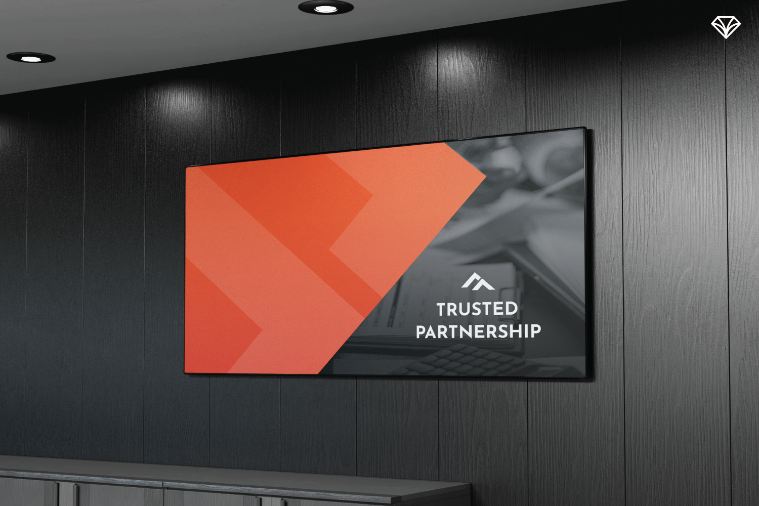
The design was created to be flexible and adaptable, performing seamlessly across digital, print, and environmental applications.
Although FERVELL is based in Erie, their brand and service model were built with flexibility in mind, making their innovative, educational approach accessible to clients wherever they are. The focus is always on helping real people take control of their financial future, no matter the size or type of their business.
Deliverables That Brought the Brand to Life

The website guides visitors smoothly, creating a clear and confidence-inspiring experience.
We designed a brand and website that reflects trust, clarity, and luxury—without feeling cold or corporate:
Client-friendly website with clarity-first navigation
Tiered service icons to visually guide clients to the right fit
Educational blog with real case studies
Easy-To-Spot Testimonials for trust-building
Strategic pops of orange to guide the eye and add excitement
The result? A brand that stands apart in the CPA world—elevated, modern, and built for people with vision. 💎
Ready to elevate your brand and stand out with clarity and confidence? Get in touch with Gem City Creative today.