How the Erie Regional Chamber Modernized Its Brand to Reflect a Stronger, More Unified Future
Why Modernizing Your Brand Matters
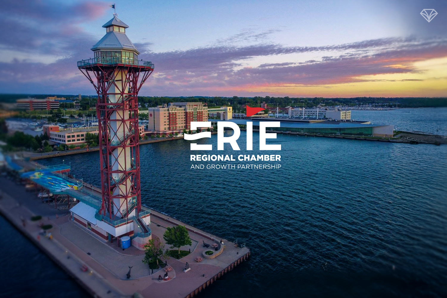
Erie is a city at a crossroads—a community reshaping its identity from a historic rust belt economy into a region of innovation, collaboration, and growth. When the Erie Regional Chamber and Growth Partnership approached Gem City Creative, they were ready to do more than update their logo—they needed a modern, unified brand that reflected forward momentum.
For organizations advocating for local businesses, a strong visual identity isn’t just “nice to have.” It communicates leadership, clarity, and a cohesive message the entire community can rally behind. That’s exactly what the Chamber set out to accomplish.
The Challenge: A Dated and Fragmented Identity
The Chamber’s existing visual identity lacked the modern presence needed for an organization driving economic transformation. Key pain points included:
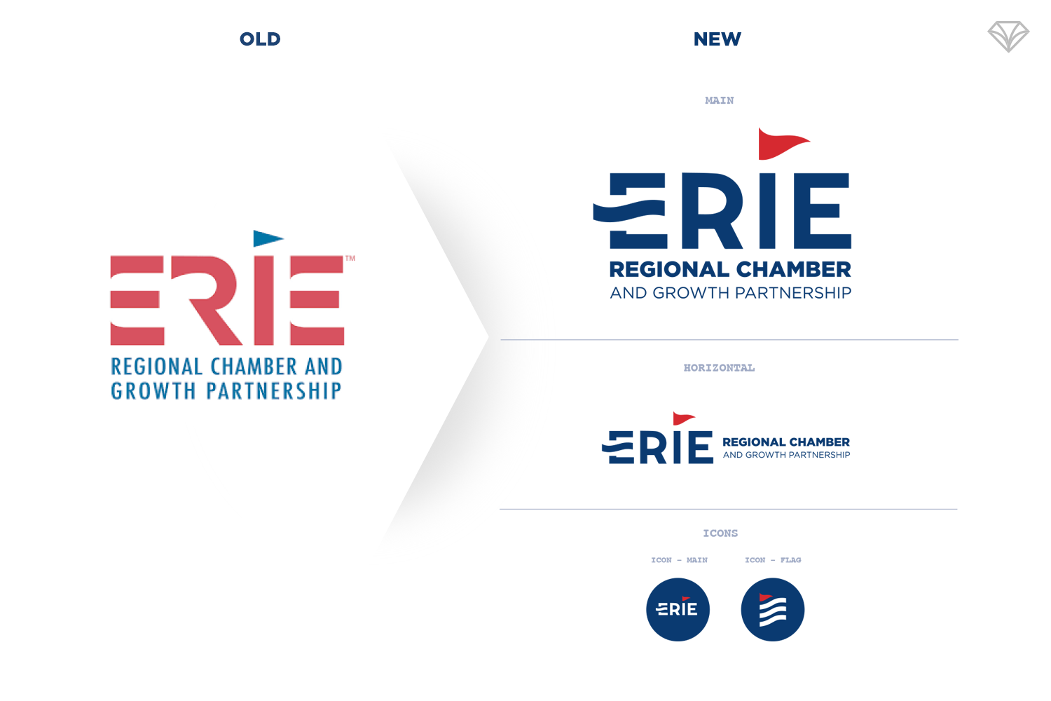
A dated logo with no sense of forward motion
Visual fragmentation—each sector operated under different logos
No unified brand system tying all internal divisions together
Underutilized colors with no structure or purpose
For a forward-thinking organization, the lack of cohesion made it difficult to communicate a clear, consistent message.
A refreshed visual language for a revitalized region.
Our Approach: Strategy First, Design Second
Before touching a single design concept, we led the Chamber through a series of deep-dive brand strategy sessions. Very quickly, one thing became clear: the Chamber is a highly complex, multi-layered organization. Any new identity needed to bring clarity rather than add noise.
From these sessions, we uncovered brand attributes that shaped our direction—strength, innovation, supportive, bold, relevant and inspirational. These key words became the guiding forces behind the visual refresh.
The Solution: A Modern, Cohesive Brand System
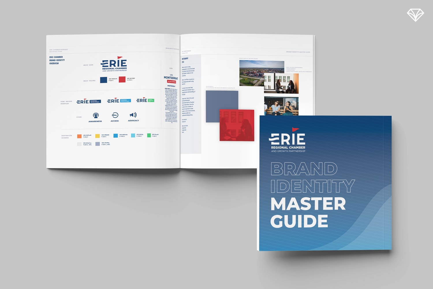
A master guide is the perfect resource to keep everyone aligned and moving in the same direction.
1. A Unified Color System
Instead of multiple disconnected logos, we developed a color-coded visual system.
The Chamber already had a versatile color palette, but it lacked structure. By assigning intentional meaning and use cases for each color, we created a flexible system that visually tied every sector back to the core brand.
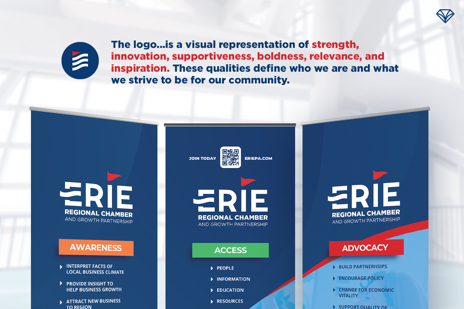
2. A Logo That Represents Movement, Momentum, and the Region
The new mark introduces:
A dynamic flag and wave shape built into the “E,” symbolizing progress
A subtle reference to lake Erie—without falling into overused regional clichés
A clean, modern form that represents unity and forward motion
The logo is a visual representation of strength, innovation, supportiveness, boldness, relevance, and inspiration.
3. A Refined Typography System
We selected a type suite designed to feel modern, bold, and accessible:
Gotham for headlines — strong, confident, and clean
Lora for supporting text — adding sophistication and contrast
Open Sans for body copy — readable, approachable, and widely available
Together, this combination creates a polished, professional aesthetic.
4. Photography Guidelines That Tell the Story of Erie
To visually reinforce the Chamber’s role in community leadership, we recommended:
Drone shots showcasing a comprehensive view of the region
Candid, professional people-focused photography to highlight connection
Local scenery that emphasizes Erie’s economic and cultural resurgence
Color filters to blend imagery seamlessly into the brand system
Deliverables and Ongoing Partnership
Over the past several years, GCC has partnered with the Chamber on:
Annual reports
Social media graphics
Event branding
Anniversary graphics
Visual assets for major events like Erie Homecoming
With the recent new leadership of CEO Brandon Mendoza, this revitalized brand lays a stronger foundation for the region’s future—and we’re proud to continue supporting that mission.
Conclusion: A Brand Built for Progress
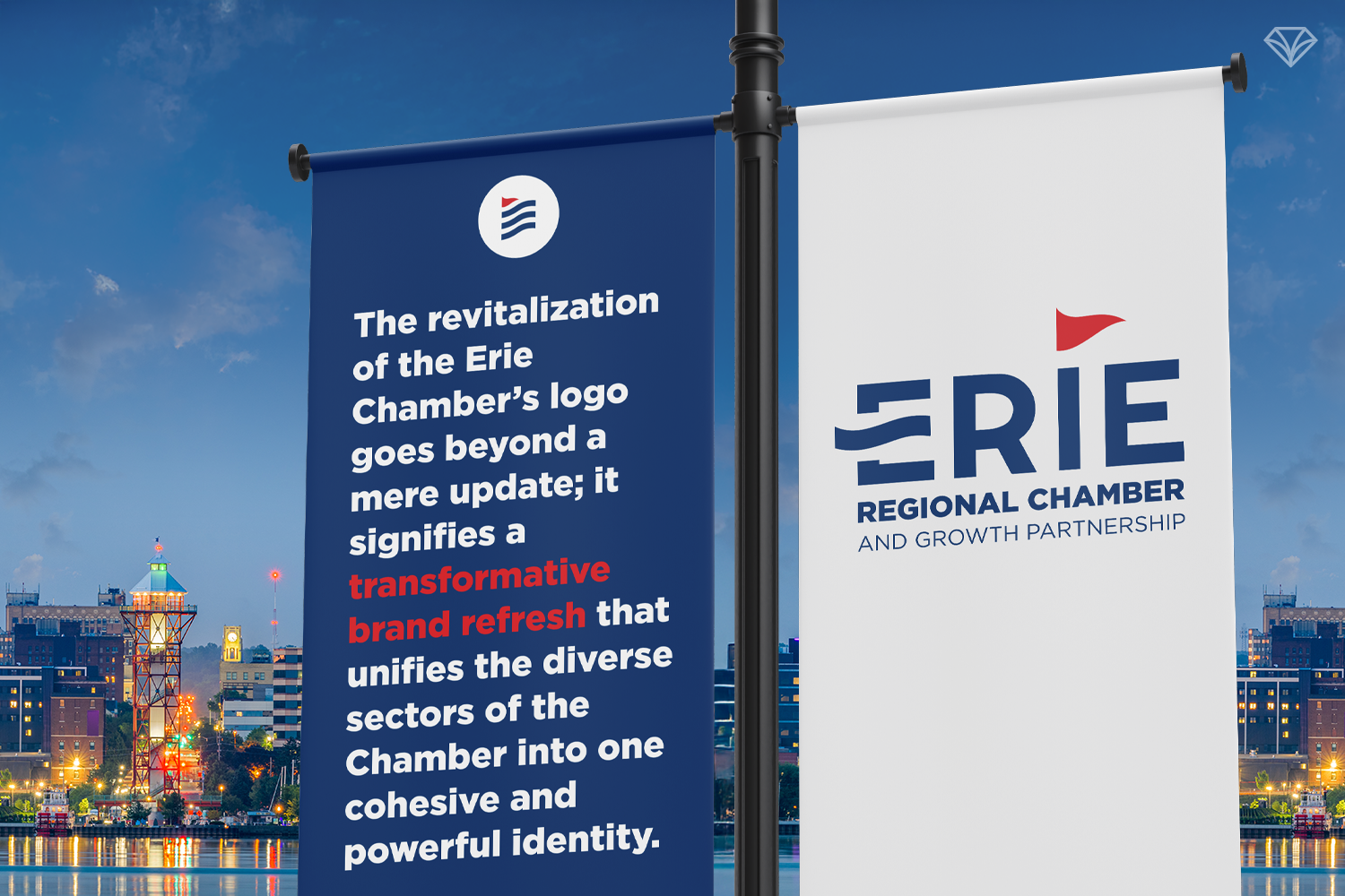
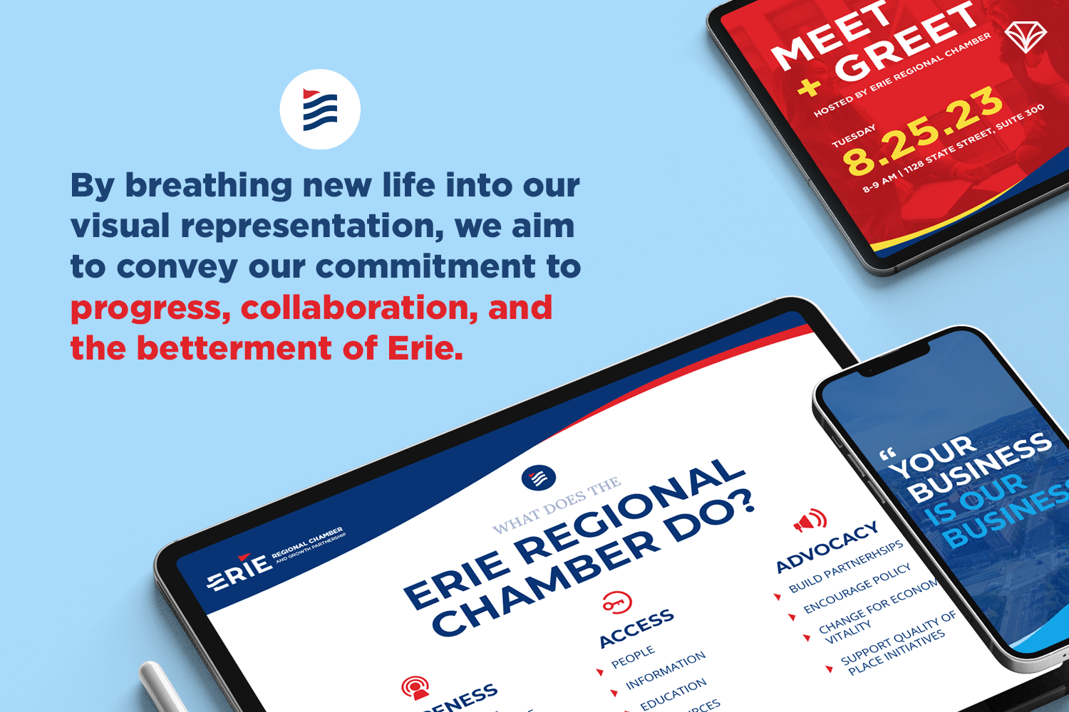
Modernizing the Chamber’s visual identity wasn’t just a design project—it was a transformation that reflects the region’s commitment to progress, collaboration, and renewed economic momentum.
A unified, strategic brand helps organizations not only look better—but lead better. 💎
“...From the very beginning, Gem City Creative displayed an exceptional level of professionalism, creativity, and attention to detail. The design process was smooth and collaborative, with the firm taking the time to understand our brand’s essence and vision. They actively involved us in every step, carefully listening to our ideas and incorporating them into the final concept.
The new logo and visual identity took the essence of our brand and gave it new life. Our members have already started to notice and appreciate the refreshed look. ”
Are you curious to know what a brand refresh can do for your company? Send us a message and let’s chat about it!