How Lab Aids’ Fresh New Brand Identity Helps Teachers Bring Learning to Life
In today’s education landscape, teachers need more than materials—they need engaging, student-centered tools that create meaningful learning experiences. Lab Aids, a New York based company delivering curriculum and supplemental programming, has spent years empowering classrooms with hands-on science kits that make learning tactile, exciting, and memorable. Their new partnership with Connected Mathematics marks a bold chapter—one that required a visual identity as strong as their impact.
As Lab Aids expanded into math kits and workbooks, they found themselves at a pivotal moment. Their product offering had evolved, but their brand wasn’t telling the full story. In a crowded education market—especially at national trade shows—they needed a modern, vibrant look that would stand out instantly while honoring the approachable, educator-focused personality that makes them unique.
The Challenge
The partnership with Connected Mathematics brought a fresh opportunity, and a major branding question:
How do you bring two educational powerhouses together visually without losing the identity teachers already trust?
Lab Aids wanted a system that felt unified across math, science, and corporate communications—yet still gave each area its own personality. Their existing palette had potential, but the design applications felt inconsistent and didn’t fully reflect their fun, explorative, student-centered energy.
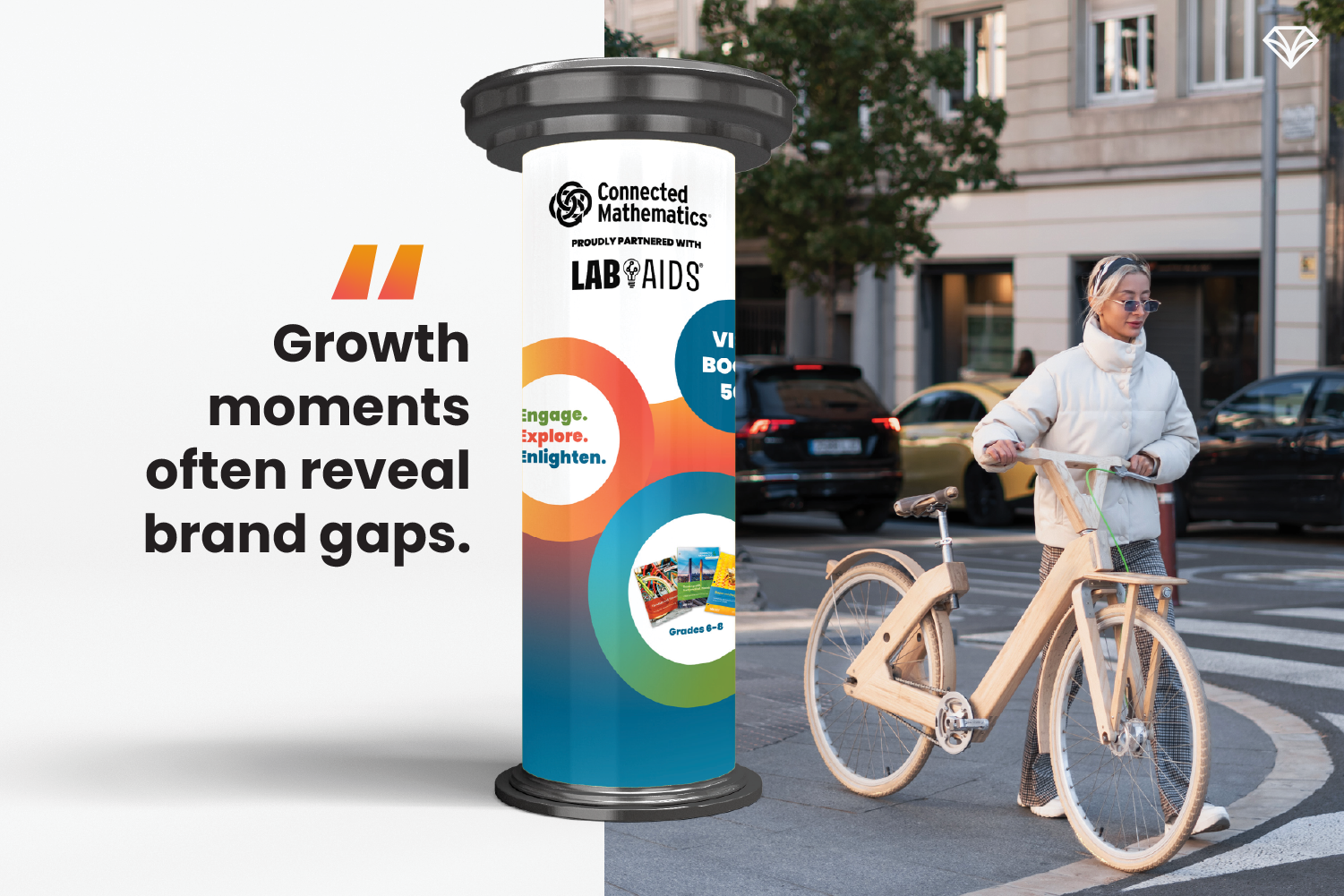
“Growth moments often reveal brand gaps. Lab Aids needed a visual system that could evolve with them—and bring clarity to their expanding offerings.”
Our Solution: A Color-Coded, Teacher-Friendly Visual System
To create both clarity and cohesion, we built a color-coded system representing each core branch of the brand:
Math: Coral red with yellow and orange accents
Science: Green with supportive navy
Corporate: Navy and blue, with optional cross-brand colors and bubble elements
Each branch feels distinct but still lives comfortably within one unified visual world.
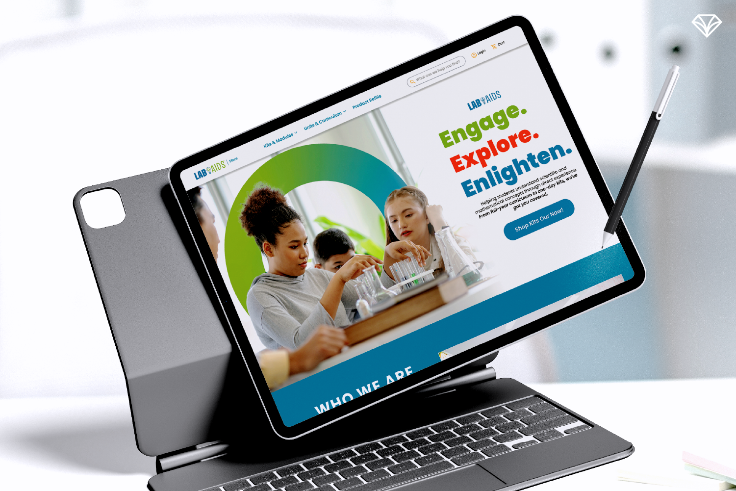
The background gradients bring energy and motion, while playful “bubbles” create balance, visual consistency, and plenty of adaptable space for content. This system makes the brand instantly recognizable across every touchpoint—from tradeshow booths to book covers—while giving educators a joyful, welcoming feel that mirrors their classroom mission.
Typography & Imagery
We selected Poppins as the primary font for its clarity, flexibility, and friendly tone. Its wide range of weights allows for clean hierarchy without sacrificing approachability.
While the brand does not rely heavily on stock photography, imagery is used intentionally—featuring local landscapes when relevant and, more importantly, students engaging with the kits in real classroom environments. These images ground the brand in authenticity and remind educators that Lab Aids exists to make learning fun.
“Bright gradients and playful bubbles create a unified, joyful identity that feels both modern and unmistakably Lab Aids.”
Designed With Educators in Mind
Throughout the process, we kept Lab Aids’ core audience at the forefront: teachers, administrators, and curriculum specialists. Their materials need to be both functional and delightful. The new identity helps educators quickly identify the right product, understand its purpose, and feel confident about the quality inside.
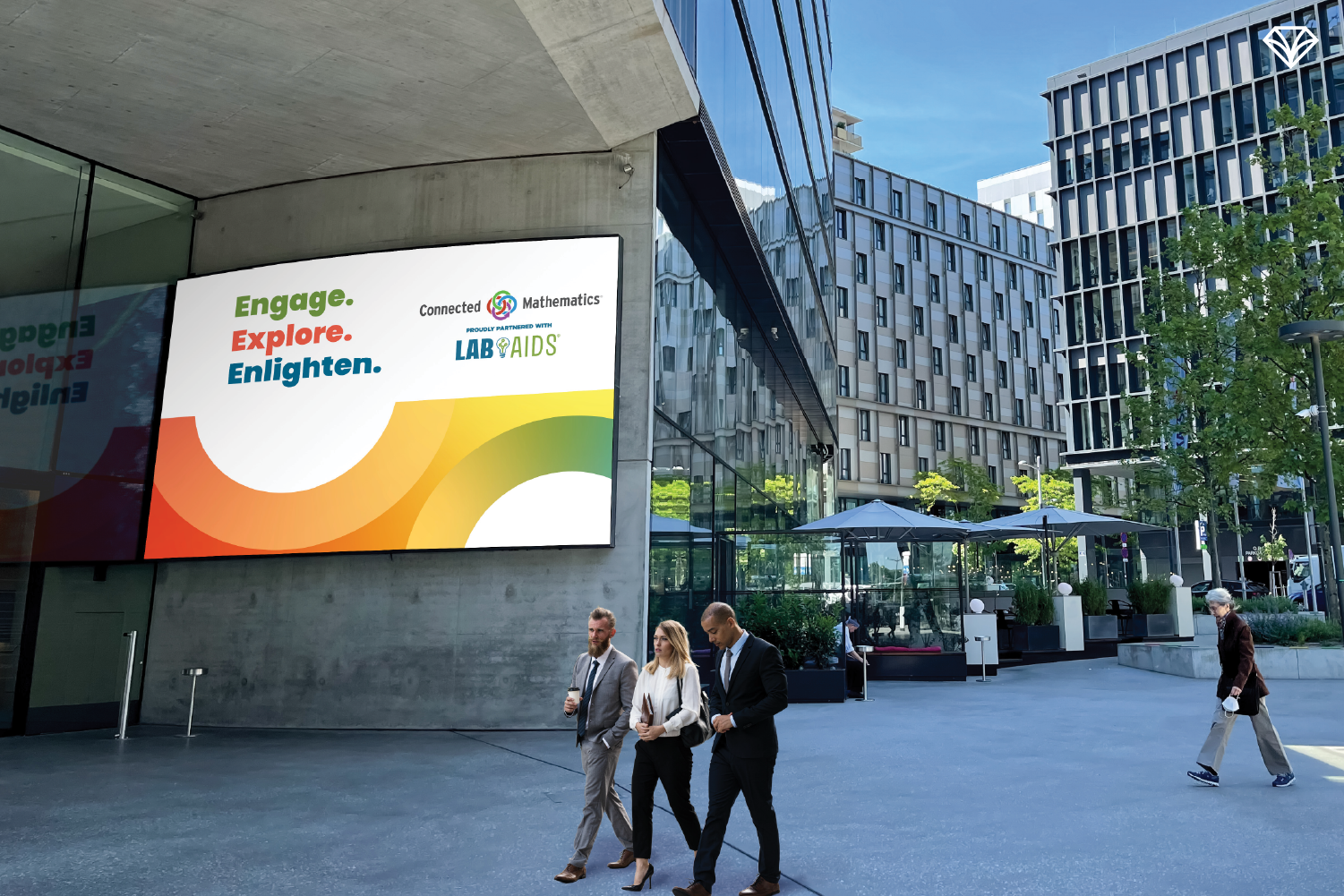
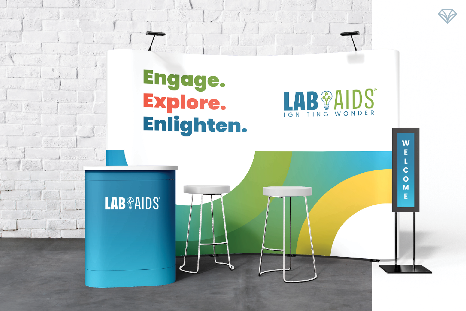
A Standout Presence at Tradeshows
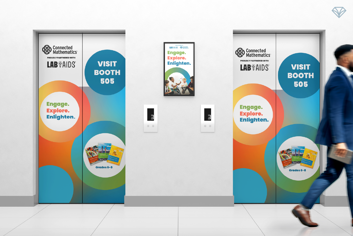
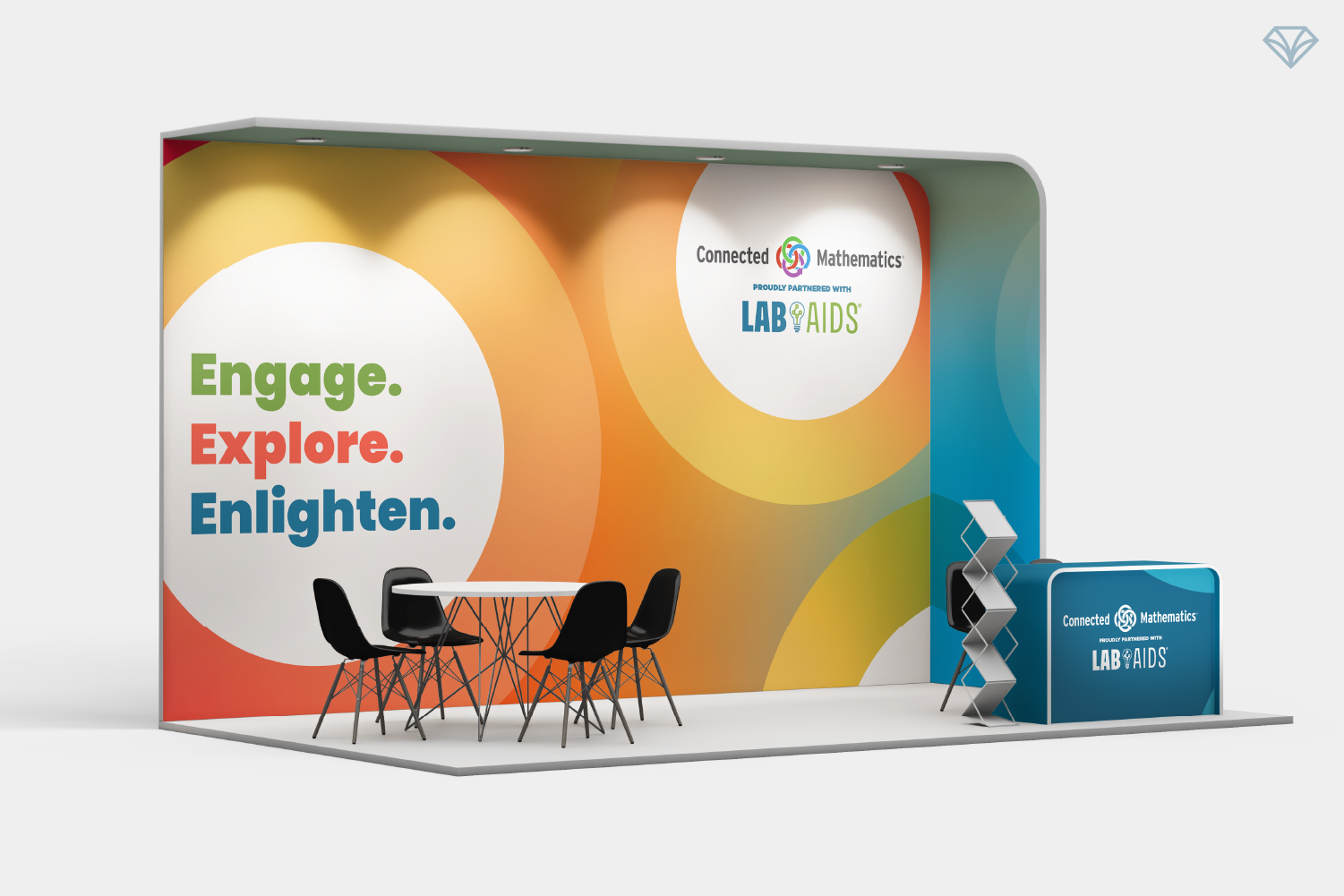
Because Lab Aids connects with many of its partners and customers at national conferences, we built the brand to shine at scale. Bright, modern gradients and clean layouts make the booth hard to miss. Column wraps, elevator clings, posters, postcards, and a full 20-ft backdrop now help them stand out in even the busiest venue.
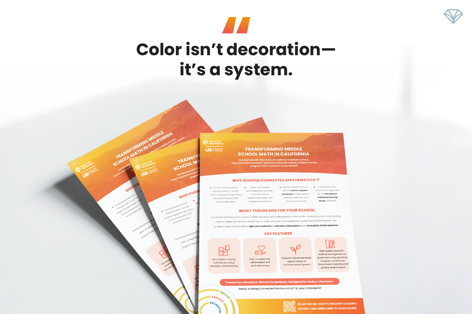
Even their math and science book designs received a thoughtful refresh—clean layouts that elevate important content while maintaining strong color coding to instantly differentiate subjects.
A Modern Identity for a Modern Era of Learning
Lab Aids has always been about hands-on, curiosity-driven learning. With their expanded product line and new partnership with Connected Mathematics, this refreshed brand identity allows them to bring that mission to life with clarity, excitement, and visual impact.
It’s fun. It’s fresh. It’s unmistakably Lab Aids. 💎
We love elevating brands! Hear what Kyle Hendricks from Lab Aids says about their new visuals.
Is it time for your brand to become unmistakably yours? Leave us a message in the contact form below and let’s set up a time to chat!