How Project Curb Appeal Built an HGTV-Inspired Brand That Still Felt Local
What Happens When a Community Project Needs More Than a Good Idea?
A great mission can only go so far without a strong identity behind it.
That was the challenge facing Project Curb Appeal, a community-driven home renovation initiative founded by Megan Demarco and Stacey Santos of ReMax Real Estate. Inspired by the excitement of home transformation shows on HGTV, the project brings together volunteers to renovate the exteriors of homes for families who otherwise could not afford the repairs.
The work changes more than houses. It gives people a renewed sense of pride in where they live.
But before even touching a 2x4, Project Curb Appeal needed a brand that could capture the same energy and community spirit behind the mission itself.
That’s where Gem City Creative came in.
The Challenge: Balancing TV Show Energy With Local Authenticity
Project Curb Appeal already had a compelling story.
They had volunteers. They had a vision. They had community support.
What they did not have was a visual identity that could capture attention and help people instantly understand the excitement behind the project.
The founders wanted the branding to feel inspired by the polished style of HGTV show graphics while still feeling approachable and connected to Erie.
That balance mattered.
If the branding leaned too far into television-style entertainment, it risked feeling disconnected from the local community. If it felt too simple or grassroots, it could lose the energy needed to attract attention, volunteers, and support.
The identity needed to feel exciting without losing authenticity.
Creating a Brand That Feels Like a Show People Want to Watch
Our approach focused on creating a clean and recognizable identity system rooted in home renovation culture while staying grounded in the Erie community.
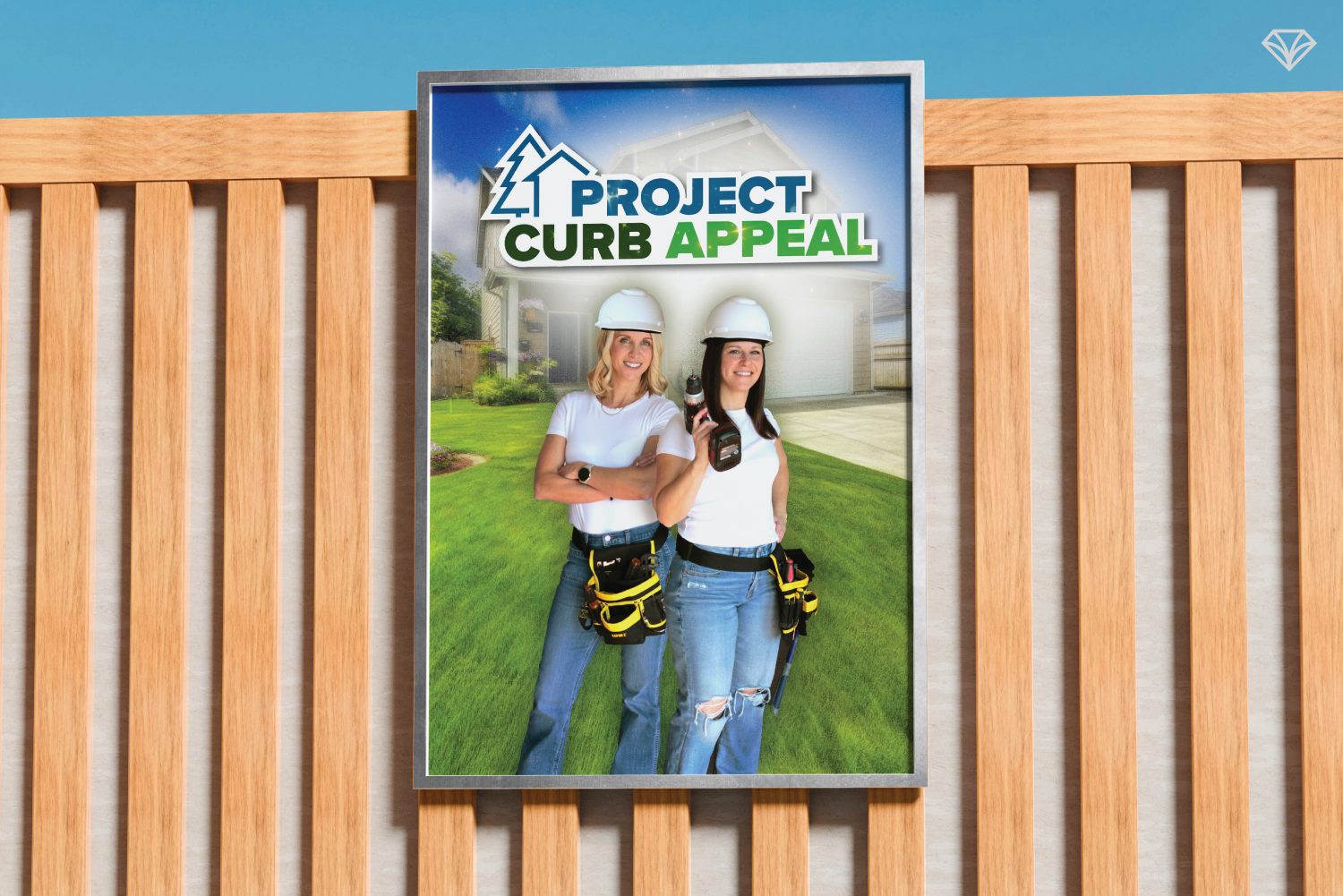
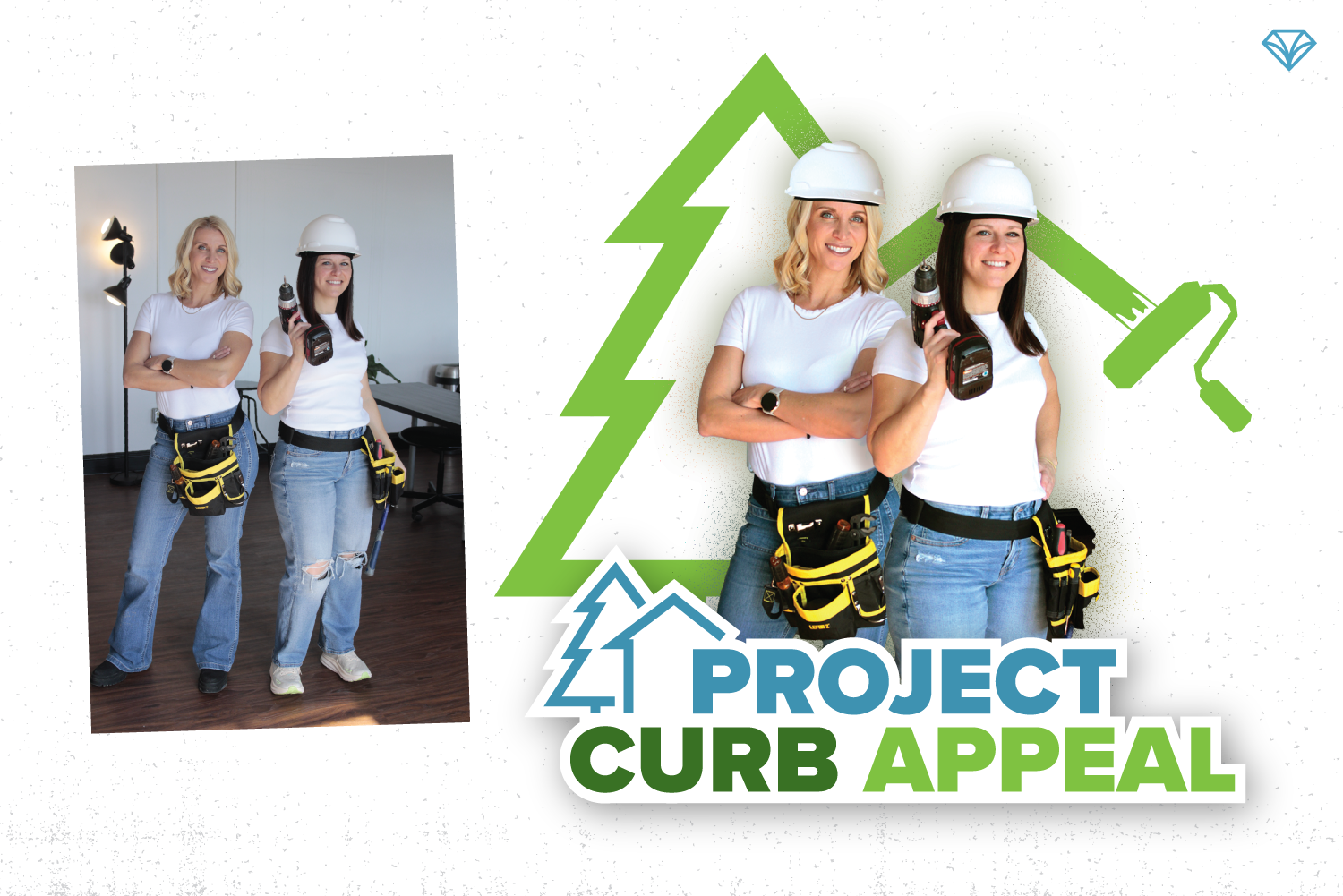
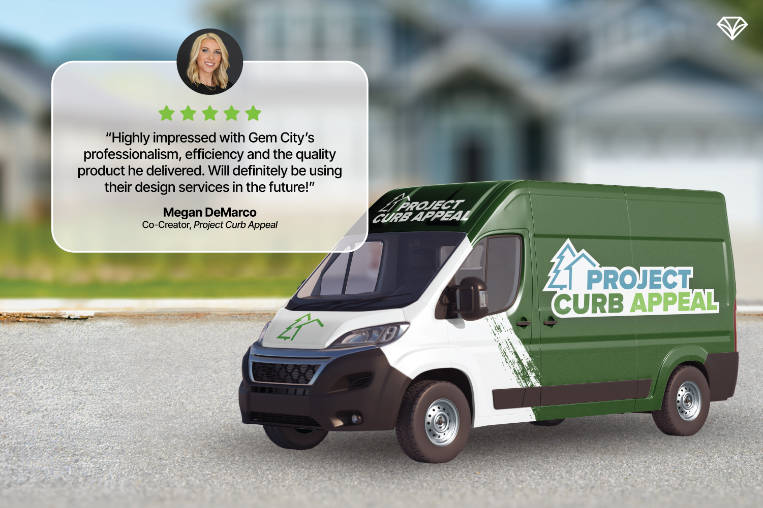
The primary logo was inspired by bold HGTV-style typemarks with a structured white outline that gave the branding a polished and confident feel.
From there, we developed a supporting graphic system that introduced more depth, movement, and personality. This helped create the “showtime” energy the founders were looking for while still keeping the brand approachable.
The result feels familiar to fans of home renovation television but personal enough for local audiences to connect with.
Designing Around the Audience
Every branding project works better when the audience is clearly understood.
For Project Curb Appeal, the audience was made up of Erie residents who care deeply about community improvement and enjoy the excitement of home transformations.
That understanding shaped every visual decision throughout the brand.
Color Palette
The blue and green color palette was chosen to reflect outdoor renovation work, landscaping, and the fresh feeling that comes with a home transformation.
The colors also connect naturally to the spring and summer seasons when many of the renovations take place.
Most importantly, the palette feels optimistic and welcoming.

Typography
We selected clean sans serif fonts with sharp details to mirror the structured look of the logo itself.
The typography helps reinforce the idea of renewal. Fresh homes. Fresh starts. Fresh curb appeal.
It also keeps the identity modern and easy to use across flyers, social media, signage, and promotional graphics.
Photography Style
The imagery direction focused on bright suburban neighborhoods and sunny outdoor environments similar to the Erie communities the project serves.
This helped the branding feel relatable instead of staged.
The goal was never to create a flashy television brand disconnected from real life. It was to create a brand that captured excitement while still feeling local and human.
The Deliverables
The final branding package included:
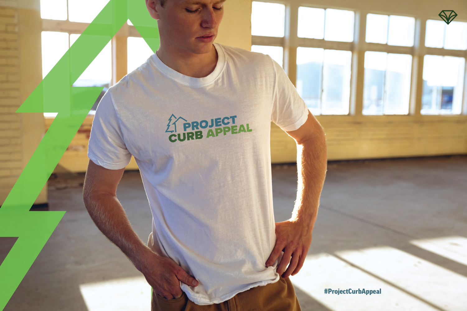
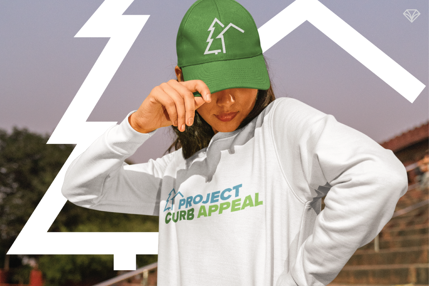
Primary logo identity
Secondary logo mark
Main promotional graphic
Social media-ready assets
Flyer design for grassroots promotion
The sub mark gives the organization flexibility across social platforms and future marketing efforts, while the larger promotional graphics help build awareness and generate excitement around the initiative.
Together, the system creates consistency while giving the project room to grow.
Why Branding Matters for Community Initiatives
Projects like this remind us that branding is not just about appearance.
It is about helping people believe in something in the moment.
A strong identity can help volunteers feel proud to participate. It can help supporters take the initiative seriously. It can help a local movement gain traction faster.
For Project Curb Appeal, the branding became part of the momentum.
It gave the initiative a recognizable presence that matched the care, effort, and transformation happening behind the scenes.
Final Thoughts
Project Curb Appeal proves that community-focused brands do not have to choose between excitement and authenticity.
With the right strategy and visual direction, it is possible to create something that feels polished, energetic, and deeply local at the same time.
At Gem City Creative, we love helping organizations bridge that gap.
Because when branding reflects both the mission and the people behind it, communities pay attention. 💎
If your organization has a strong mission but lacks the branding to bring people together around it, that’s something we can help with.
At Gem City Creative, we help community-focused organizations turn meaningful ideas into brands people recognize, trust, and support.
Ready to build momentum behind your mission? Let’s talk.