From Fear to Confidence: How Strategic Branding Helped Monster Control Turn Childhood Fears into a Trusted Experience
How Gem City Creative designed a brand that balances playfulness and credibility for families facing a common childhood challenge.
When Your Child Is Afraid of Monsters
Every parent has been there.
The lights are off. The house is quiet. Then suddenly you hear small footsteps in the hallway.
“Mom… Dad… there’s a monster under my bed!”
Fear of monsters is one of the most common childhood experiences. For kids, the fear feels real. For parents, the challenge is finding a way to comfort their child while helping them build confidence.
That’s where Monster Control comes in.
Monster Control is a unique service designed to help children face their fears in a fun, empowering way. Through a playful but structured process, they help kids feel safe, brave, and in control of their own spaces.
But before families could trust the service, the brand itself needed to communicate something very specific: safety and credibility.
That’s where Gem City Creative stepped in.
Clean, simple, and built to guide families from curiosity to confidence.
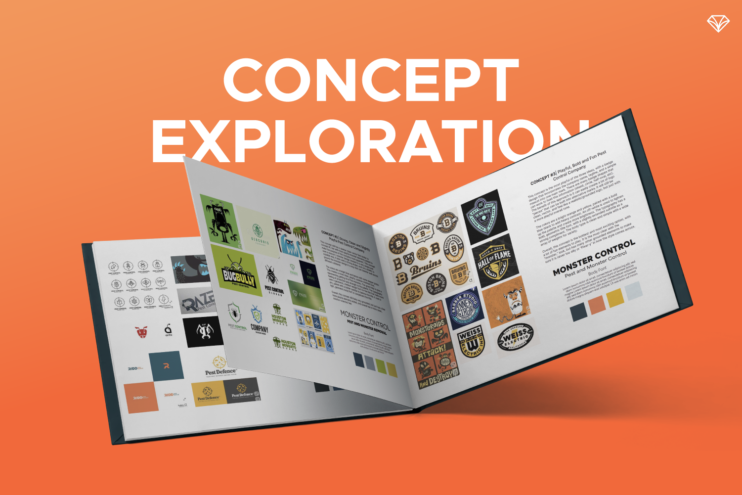
The Branding Challenge: Fun for Kids, Trustworthy for Parents
Monster Control sits at a fascinating intersection.
On one hand, it is clearly a children’s entertainment experience. The service engages kids with imagination, storytelling, and hands-on tools that make them feel like monster-fighting experts.
On the other hand, the brand also needs to feel credible and professional, similar to a real pest control company. Children need to believe the service works, and parents need to trust that the company is legitimate and thoughtful in its approach.
The existing logo leaned too far toward the playful side. It had a style that felt overly cartoonish and “Pixar-like,” which made it difficult for the brand to communicate strength and reliability.
Monster Control needed a visual identity that balanced both sides of the experience.
Playful enough for children.
Trustworthy enough for parents.
The Experience: Helping Kids Face Their Fears
Monster Control’s process begins with understanding the child’s fear.
Families start with a questionnaire that helps the team identify and even name the monster the child is afraid of. Giving the fear a name helps children externalize it and begin to take control.
Next comes the house visit.
The Monster Control team arrives equipped with specialized gadgets and tools to “inspect” the home. Children participate in the process as the team checks under beds, inside closets, and around the room to ensure everything is monster-free.
After the visit, children receive their own protective bracelet and monster detection tools to continue the mission.
The goal is simple. Help children turn fear into courage.
The challenge was finding the right balance between playfulness and credibility
The Branding Strategy
Our goal was to build a brand identity that captured three key qualities:
Strong
Dependable
Child-friendly
To do this, we took inspiration from the visual language of real pest control companies. These brands often use bold typography, simplified icons, and strong shapes that communicate reliability.
We then blended that professional tone with subtle elements of imagination and fun.
The result is a brand that feels both credible and approachable.
Where imagination meets trust, designed to speak to both kids and parents.
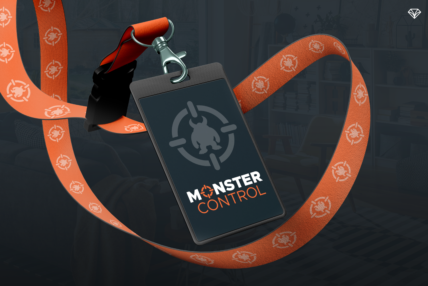
Logo Design: Sleek, Bold, and Versatile
The new Monster Control logo centers around a simplified monster mascot rendered in silhouette.
This design decision accomplished several goals:
• It created a sleeker, more modern look
• It aligned the brand visually with professional service companies
• It maintained the recognizable monster character without making it overly cartoonish
The logo system was also designed for flexibility.
The full logo badge contains several components that can be separated and used individually across different platforms. These include:
• A standalone icon
• A stylized “O” letterform
• The full logo badge
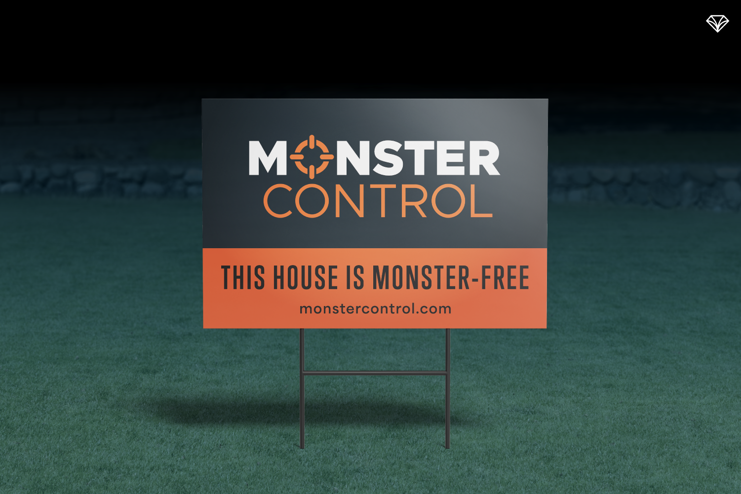
This flexibility allows the brand to work seamlessly across websites, uniforms, tools, marketing materials, and merchandise.
Consistency leads to stronger brand recognition.
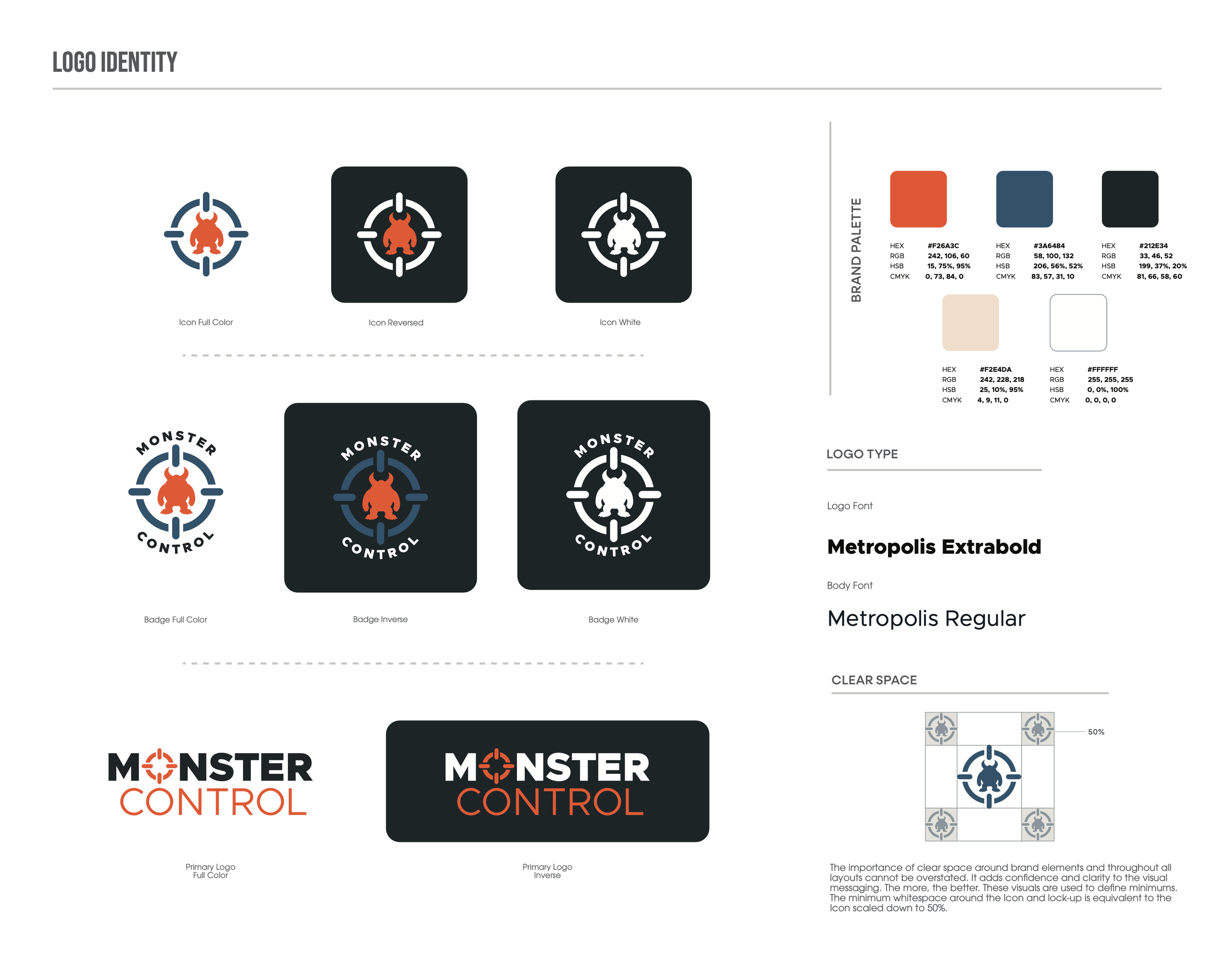
A logo designed to balance imagination with trust. The sleek monster silhouette keeps the brand playful for kids while the bold, modern style gives parents confidence in the service.
Color Strategy: Stability Meets Excitement
The Monster Control color palette balances calm confidence with playful energy.
Steely Blue-Grays
These tones communicate reliability, stability, and peace of mind. They reinforce the idea that the service is dependable and trustworthy.
Bright Orange Accents
Orange introduces excitement, imagination, and fun. It keeps the brand approachable for children and adds energy to the visuals.
Together, these colors create a contrast that feels bold but welcoming.
Typography: Bold but Friendly
The type system uses a geometric sans serif font with strong structure and clean lines.
This font family includes both bold and lighter weights, allowing the brand to balance strength with friendliness.
The bold version reinforces confidence and authority.
The lighter weight adds warmth and accessibility.
This pairing helps ensure the brand never feels too serious or intimidating for children.
A seamless journey that feels clear, calm, and confidence-building from start to finish.
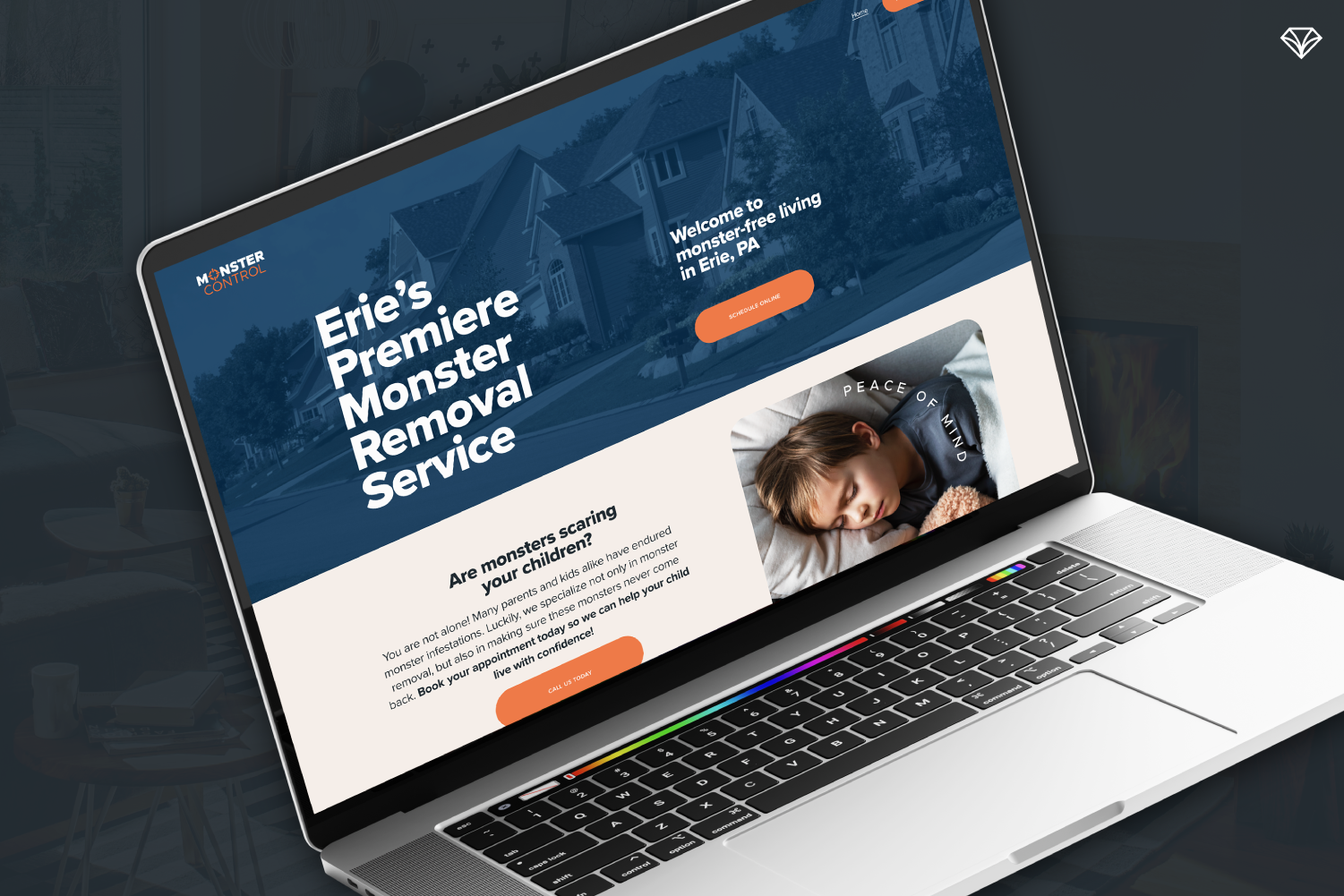
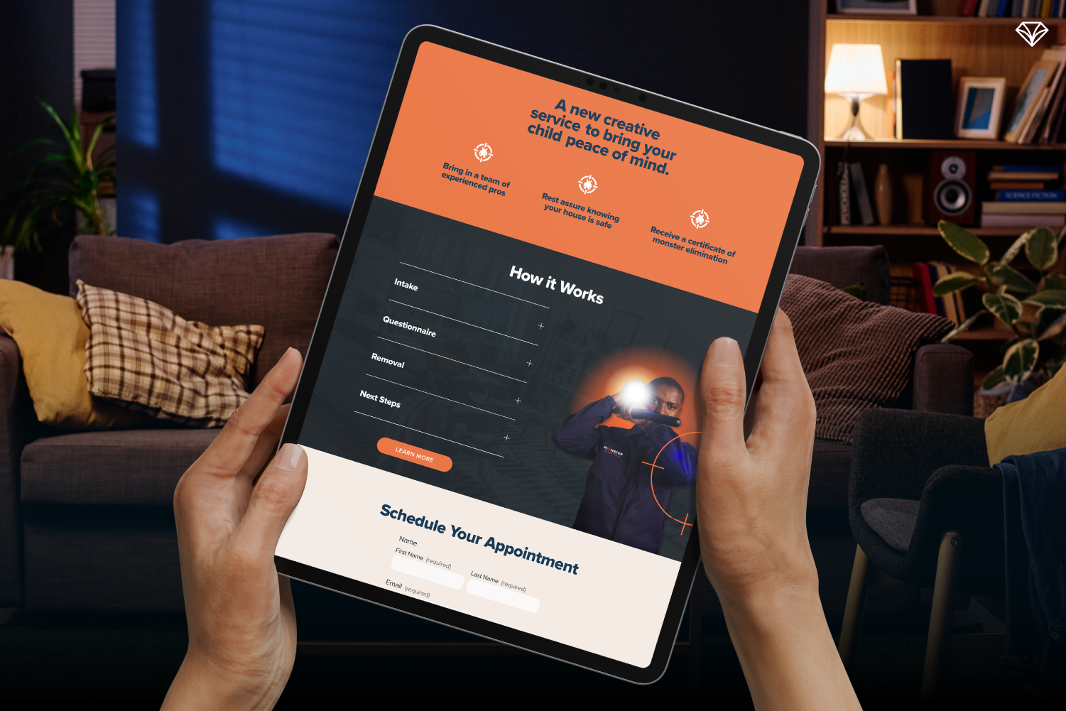
Building the Digital Experience
Alongside the visual identity, Gem City Creative developed a long-scroll website designed to clearly explain the service and encourage families to book an appointment.
The website focuses on three key elements:
Clarity
Parents quickly understand what the service is and how it works.
Confidence
FAQs and process explanations help families feel comfortable scheduling a visit.
Action
Strong calls-to-action guide visitors toward booking an appointment.
The site primarily uses the calm blue tones of the brand, with orange highlights to draw attention to key sections and buttons.
The result is a digital experience that communicates peace of mind from the very first visit.
Why This Brand Works
Great branding does more than look good.
It helps people feel something.
For Monster Control, that feeling is confidence.
Parents feel confident inviting the service into their home.
Children feel confident confronting their fears.
When branding aligns with a company’s mission, the message becomes clear.
And in this case, that message is powerful:
Fear doesn’t have to win. 💎
Ready to Build a Brand That Connects?
At Gem City Creative, we help businesses turn ideas into brands people trust.
Whether you're launching something new or refining an existing identity, strategic branding helps your audience understand who you are and why you matter.
Let’s build something remarkable together.
👉 Contact Gem City Creative to start your branding project.